鸿蒙 5.0 快速入门
一、概览
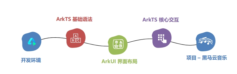
二、鸿蒙开发环境
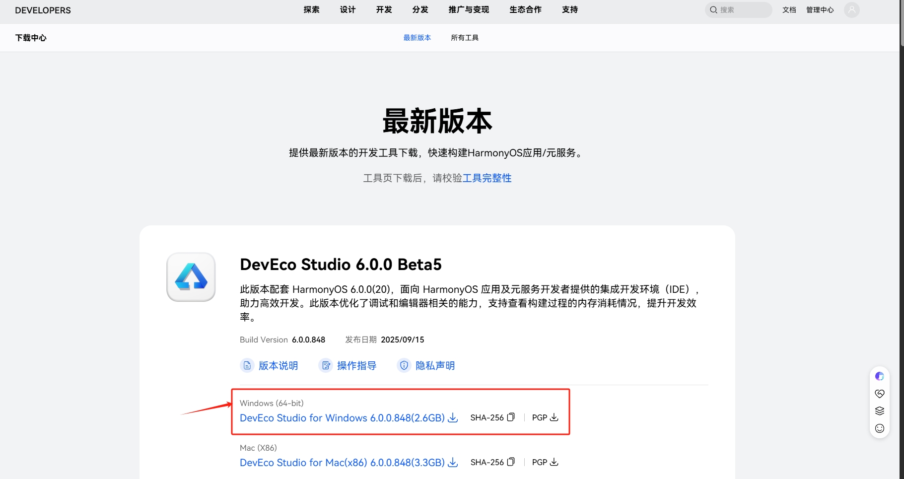
- 1). 下载
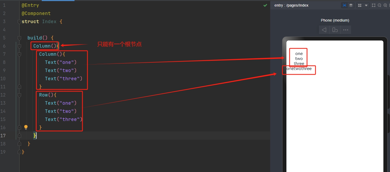
DevEco Studio
- 2). 安装
- 安装路径建议不选
C 盘(建议开一个专门的文件夹来管理,后面还有项目放置部分) - 安装路径
不出现中文或特殊符号
- 安装路径建议不选
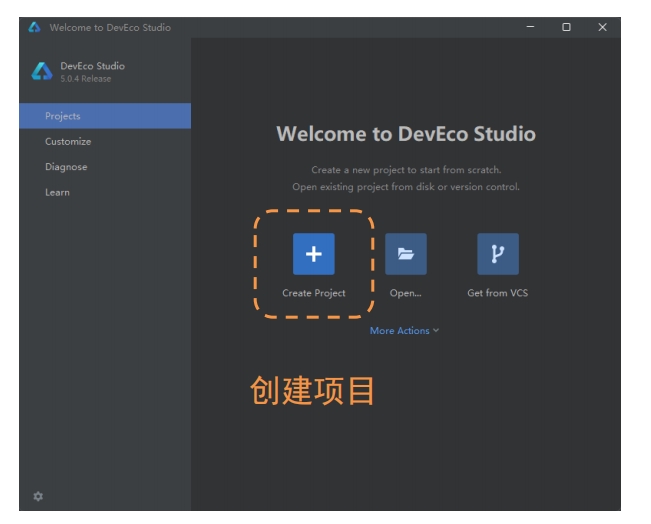
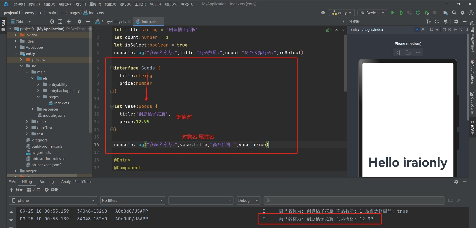
- 3). 创建项目
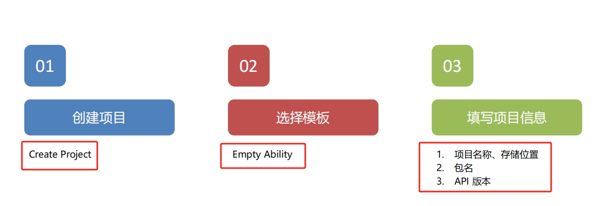
- 说明:
Bundle name:包名称 -->域名反写+项目名Compatible SDK:API 版本 16Module name:项目默认入口模块Device type: 项目支持的设备类型
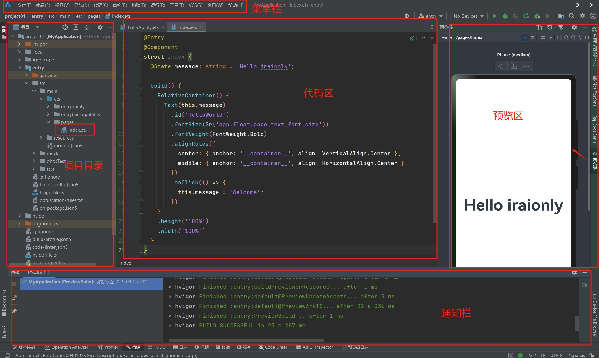
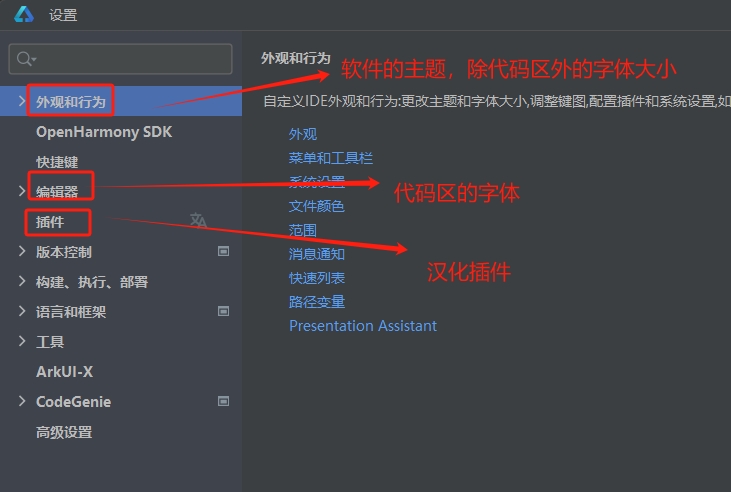
- 配置软件
三、ArkTS 基础
3.1 工程目录
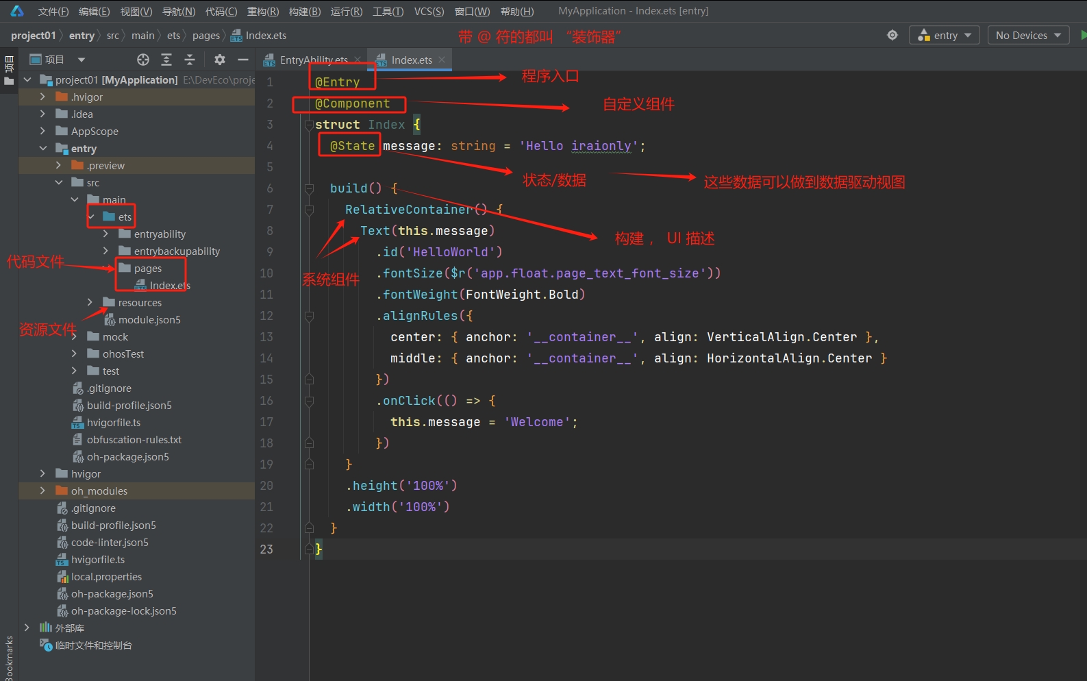
Harmony OS的主开发语言是 :ArkTS--> 基于TypeScript进行扩充和提升
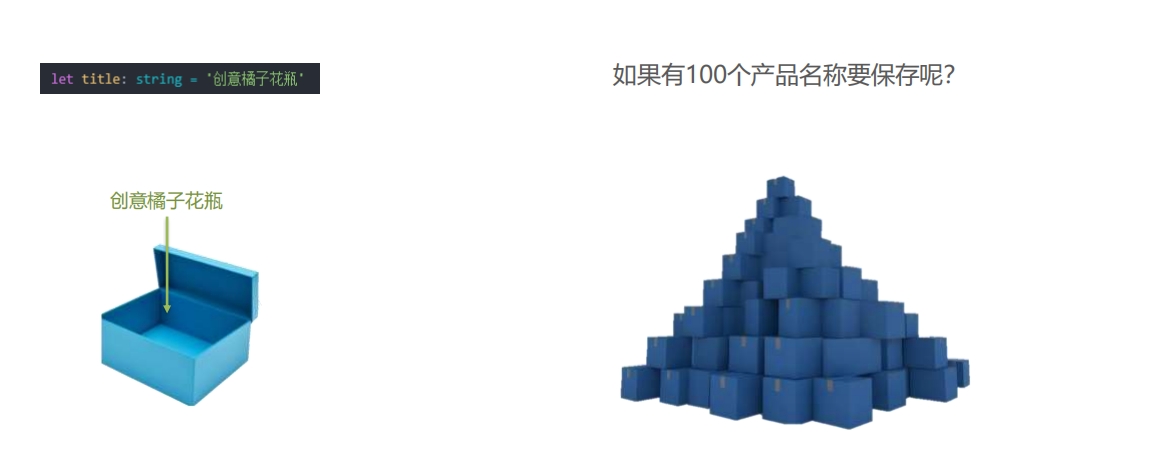
3.2 数据类型
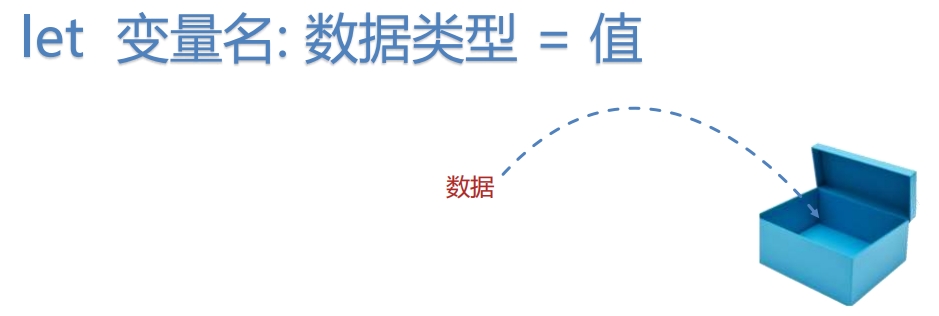
- 使用变量存储不同类型的数据
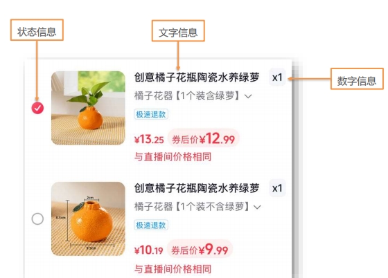
- 数据类型 :
- 文字信息 -->
字符串类型 (string) - 数字信息 -->
数字类型 (number) - 状态信息 -->
布尔类型 (boolean)truefalse
- 文字信息 -->
- 使用变量的语法规则:
- 根据规则和上面图片写出三个信息对应的变量数据:
- 注:打印和
JS的一样:console.log()
- 注:打印和
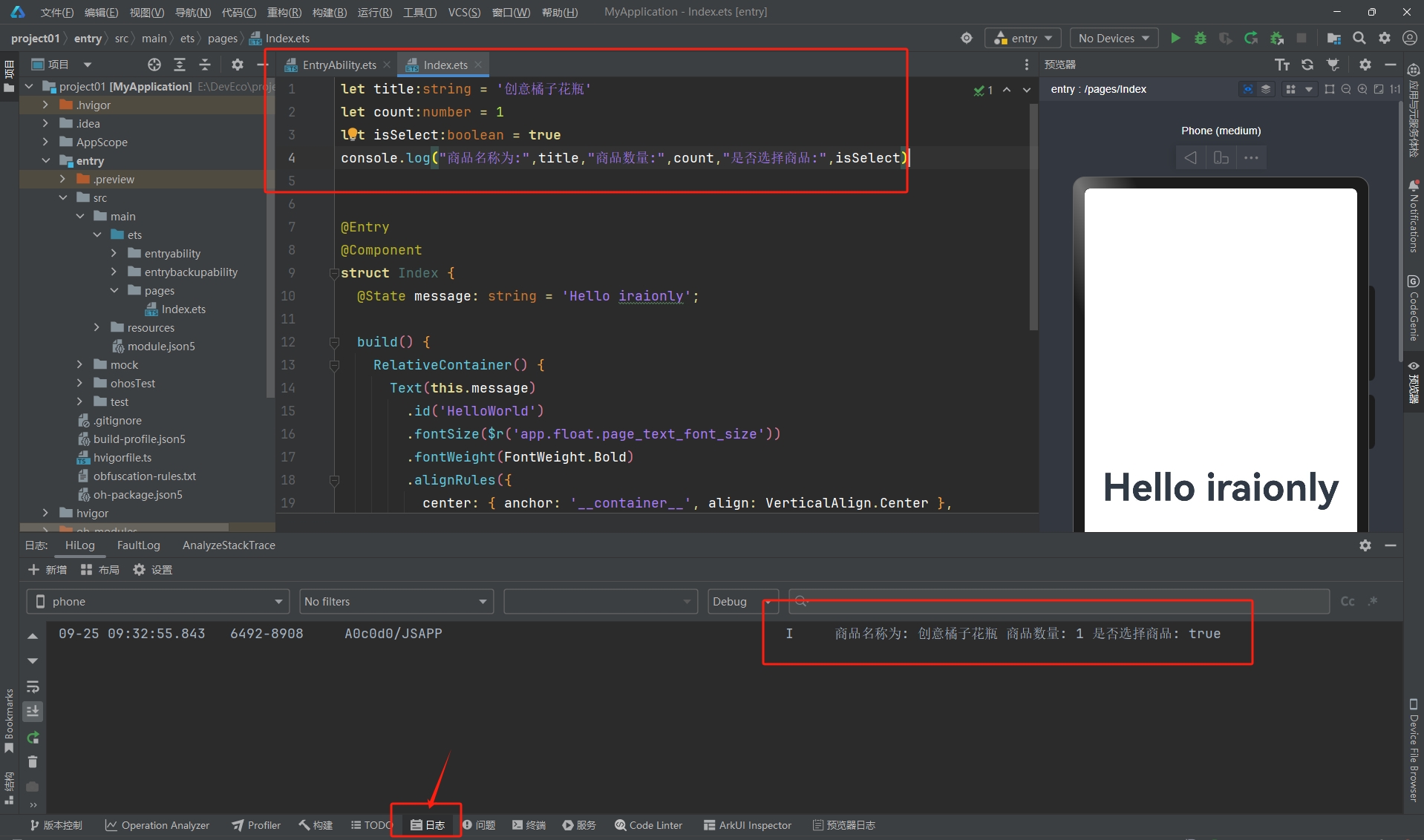
- 记得打开预览器!写好代码后
Ctrl + S保存,就可以在日志看到打印的信息了
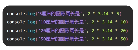
3.3 数组
- 数组:一次性保存多个
同类型的数据
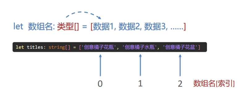
- 语法规则:
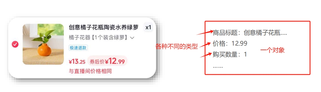
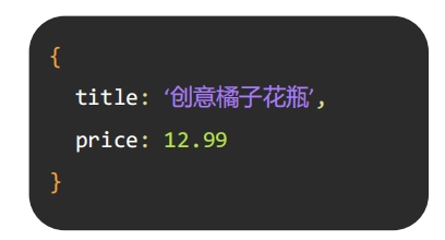
let 数组名:类型[] = [数据1,数据2,数据3,...]3.4 对象
- 对象:一次性存储多个
不同类型的数据
- 语法也是跟
JS那样:
- ❓ 但问题来了,这要怎么声明类型呢
- 这点也跟
TS那样,提供了接口约定对象的结构和类型
- 这点也跟
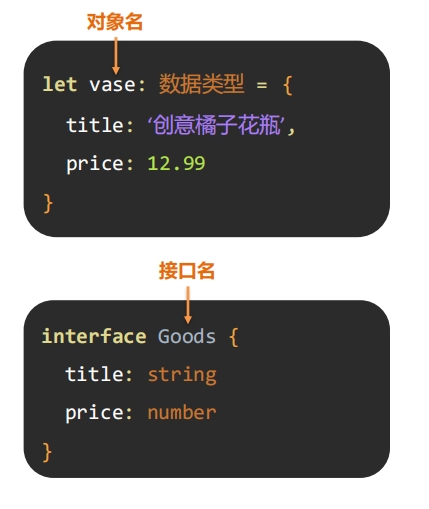
- 获取属性值 :
对象名.属性名 - 代码如下所示:
3.5 函数
- 使用函数封装代码,提升代码复用性( 总不能代码像下面那样写吧 .....)
- 定义函数
function calc(){
    ...
}- 调用函数
calc()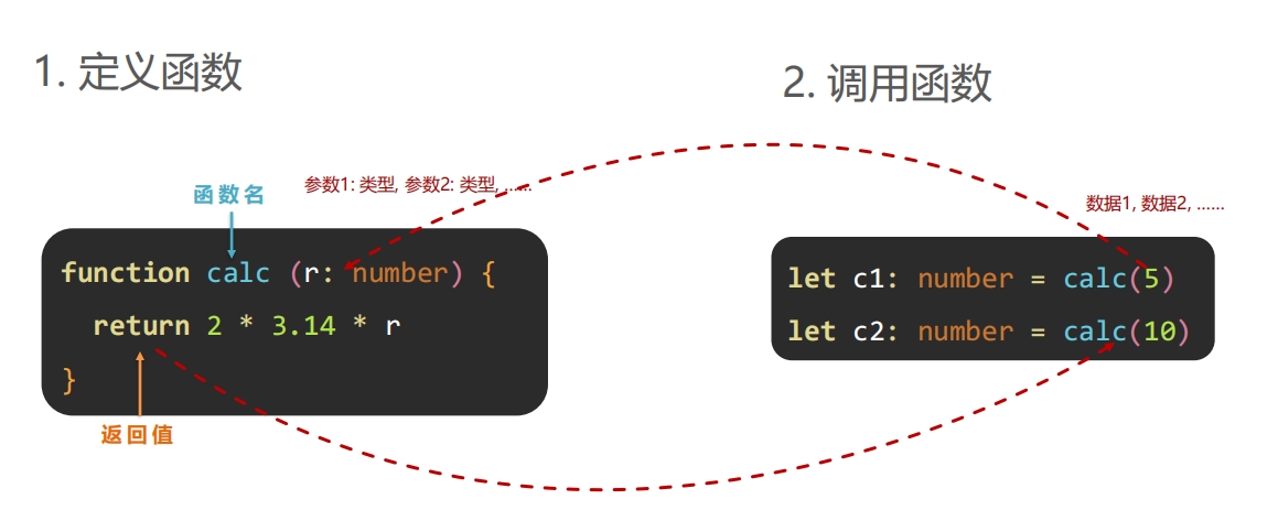
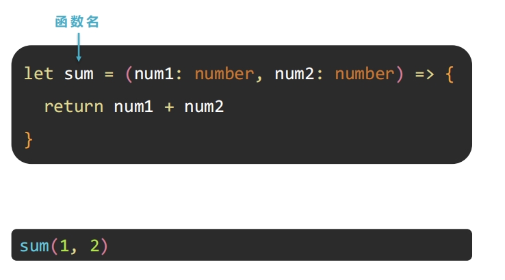
3.6 箭头函数
- 函数还不够,还想要更简洁的 -->
箭头函数
() => {}
四、ArkUI 基础
ArkUI(方舟开发框架) :构建鸿蒙应用界面的框架
4.1 组件基础
组件: 界面构建与显示的最小单位
- 比如后面要做的
黑马云音乐首页如下:(都是一个一个组件)

- 容器组件:
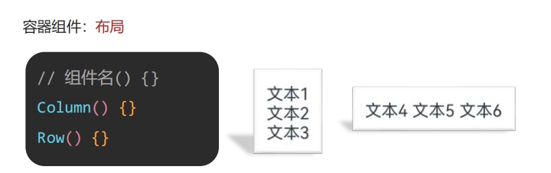
- 内容组件:
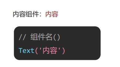
📌 鸿蒙界面构建思路:先布局,再内容!!
- 演示一个
坑:
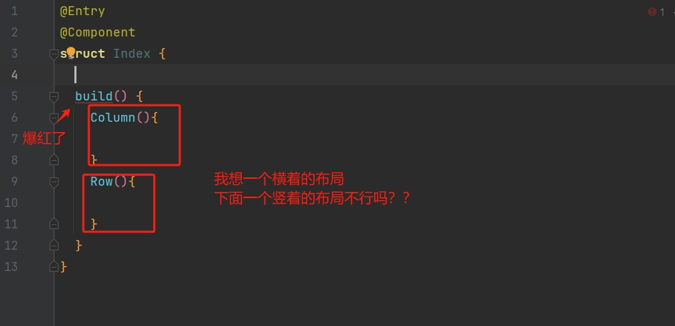
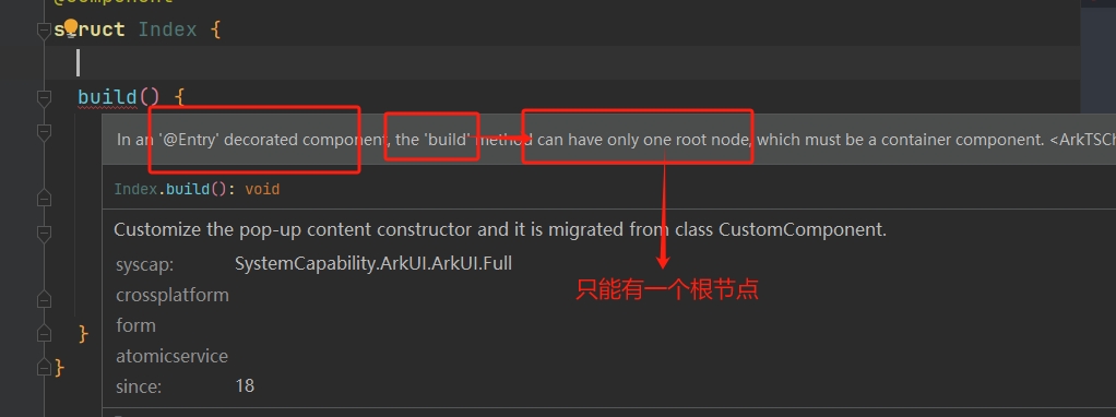
- 那么修改过后的代码:
4.2 通用属性
- 使用属性美化组件
- 常用通用属性:
| 属性名 | 作用 | 属性值 |
|---|---|---|
width | 宽度 | 数值(默认单位 vp) |
height | 高度 | 数值(默认单位 vp) |
backgroundColor | 背景色 | 色值(内置颜色 Color.red)(或十六进制色值) |
4.3 文本属性
- 使用文本属性美化文字外观样式

| 属性名 | 作用 | 属性值 |
|---|---|---|
fontSize | 字体大小 | 数值(默认单位 fp) |
fontColor | 文字颜色 | 色值(内置颜色 Color.red)(或十六进制色值) |
fontWeight | 字体粗细 | 100 ~ 900 (默认 400) |
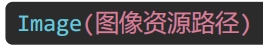
4.4 图像组件
- 使用图像组件为界面添加图像资源
- 使用图像组件
Image为界面添加图像资源
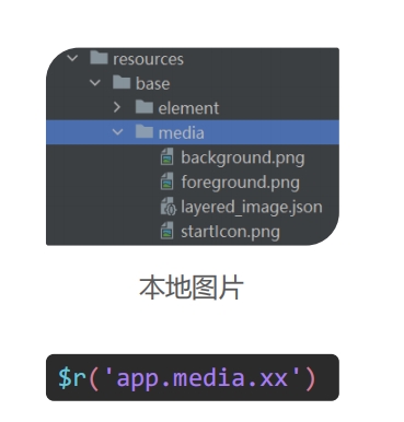
- 本地图片:
- 路径:
resources/base/media
- 路径:
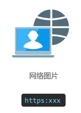
- 网络图片:
4.5 边距
- 使用内、外边距调整组件及内容的位置
- 内边距:拉开内容与组件边缘的距离
- 外边距:拉开两个组件之间的距离
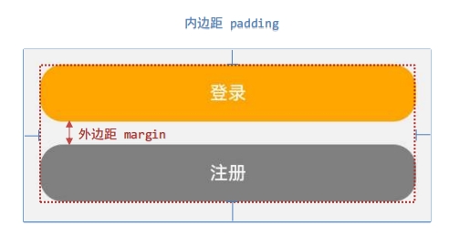
- 四个方向间距相同:
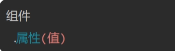
组件
	.padding(数值)
.margin(数值)- 四个方向间距不同:
组件
	.padding({top:10,bottom:20,left:30,right:40})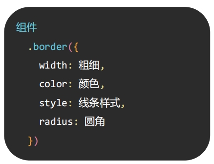
.margin({top:10,bottom:20,left:30,right:40})4.6 组件边框
- 使用
border属性为组件添加边框效果

- 语法:
4.7 列表容器
- 使用
List()布局一个横着或者竖着的列表,且超过屏幕大小的时候可滚动
- 基本结构:
List(){ //列表组件
    ListItem(){ //列表项

    }
}
	//设置主轴方向(默认就是 Axis.Vertical 垂直) Axis.Horizontal 水平方向
	.listDirection(Axis.Vertical)
.scrollBar(BarState.Off) //不显示滑动条- 扩充组件安全区(手机屏幕上下会有空,如果想要全部占满,就使用以下代码):
组件(){

}
	.expandSafeArea([SafeAreaType.SYSTEM],[SafeAreaEdge.TOP,SafeAreaEdge.BOTTOM])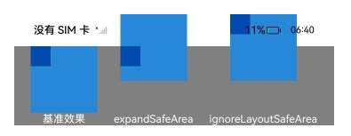
layWeight(数字)的作用:将外层组件剩余尺寸分成指定份数,当前组件占用对应的份数
4.8 案例:歌曲列表
4.8.1 思路
📌 思路:
先整体,再局部: 整体来看是从上到下,那么就需要一个Column(),那么显然要使用到
List()来存储每一个歌曲ListItem(),在每一个歌曲里又是一个横着布局的,那么需要一个
Row(),那么具体到歌曲信息(每一栏中间部分)的时候又是一个小的
Column()。先布局,再内容,后美化:先按上面那样布局好,然后再填充内容,图片就用
Image()呗,文字就用Text()呗,最后再美化,比如图片有尺寸和圆角啊,文字有大小、粗细和颜色 ...
4.8.2 扩充安全区
- 设置好宽高背景色后就会遇到下面的问题:(设置的颜色到不了手机最上面和最下面)
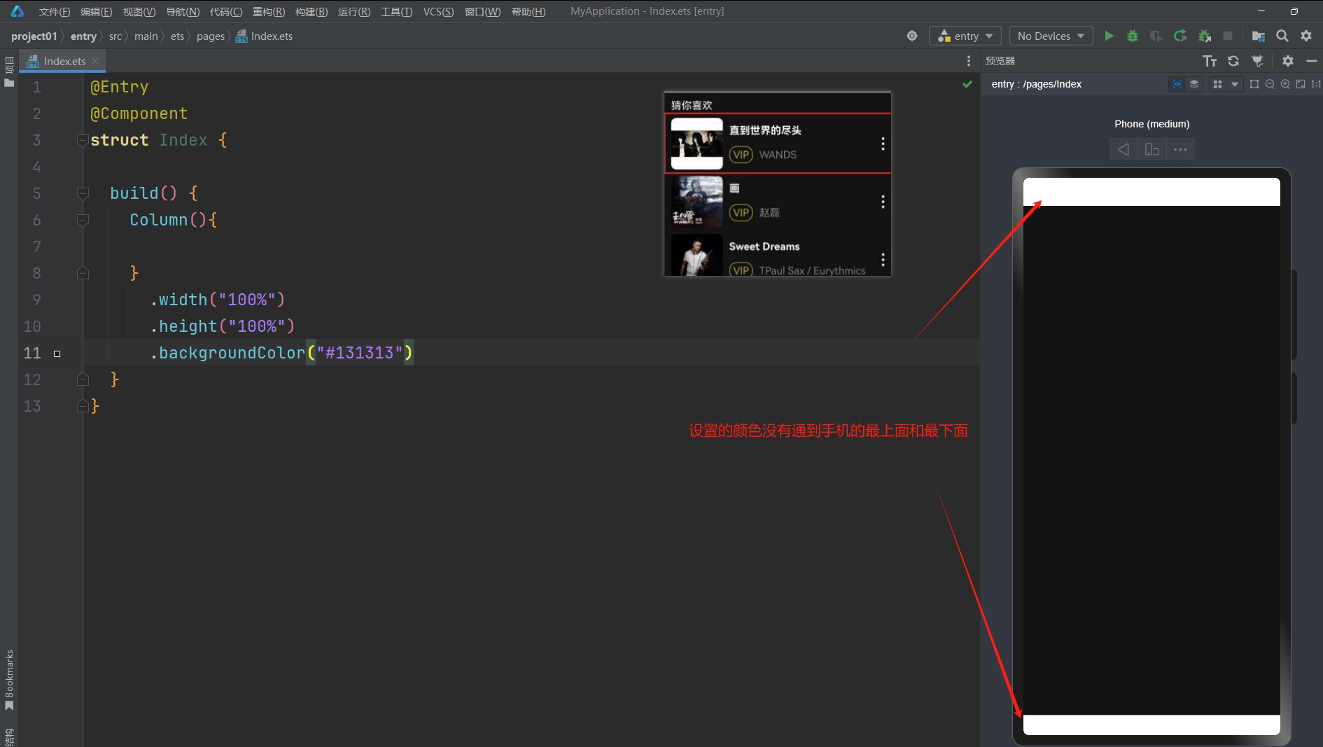
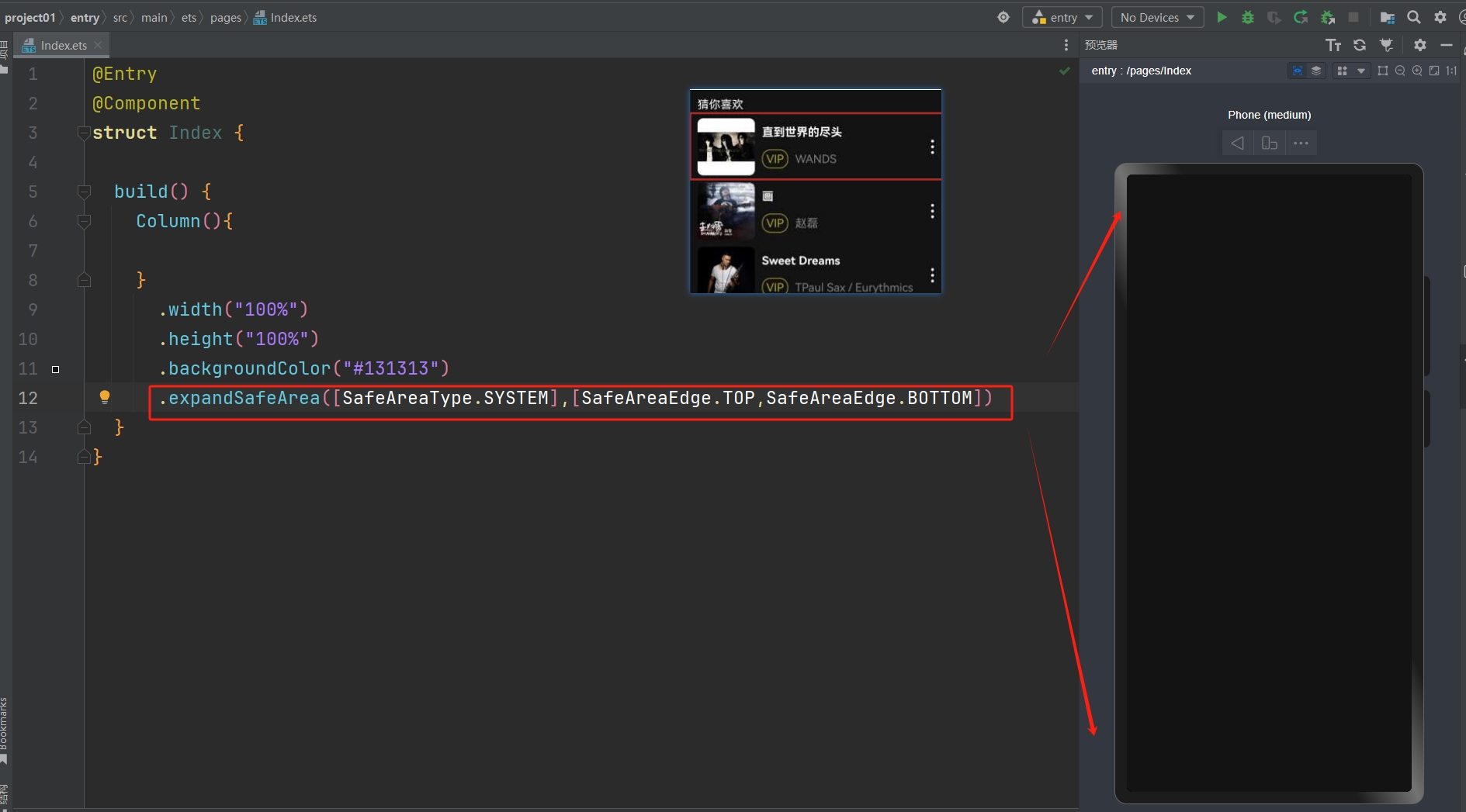
- 那么就用到了
4.7提到的扩充组件安全区的代码(直接复制粘贴就好,不用记):
.expandSafeArea([SafeAreaType.SYSTEM],[SafeAreaEdge.TOP,SafeAreaEdge.BOTTOM])- 效果如下:
4.8.3 猜你喜欢
@Entry
@Component
struct Index {
build() {
Column(){
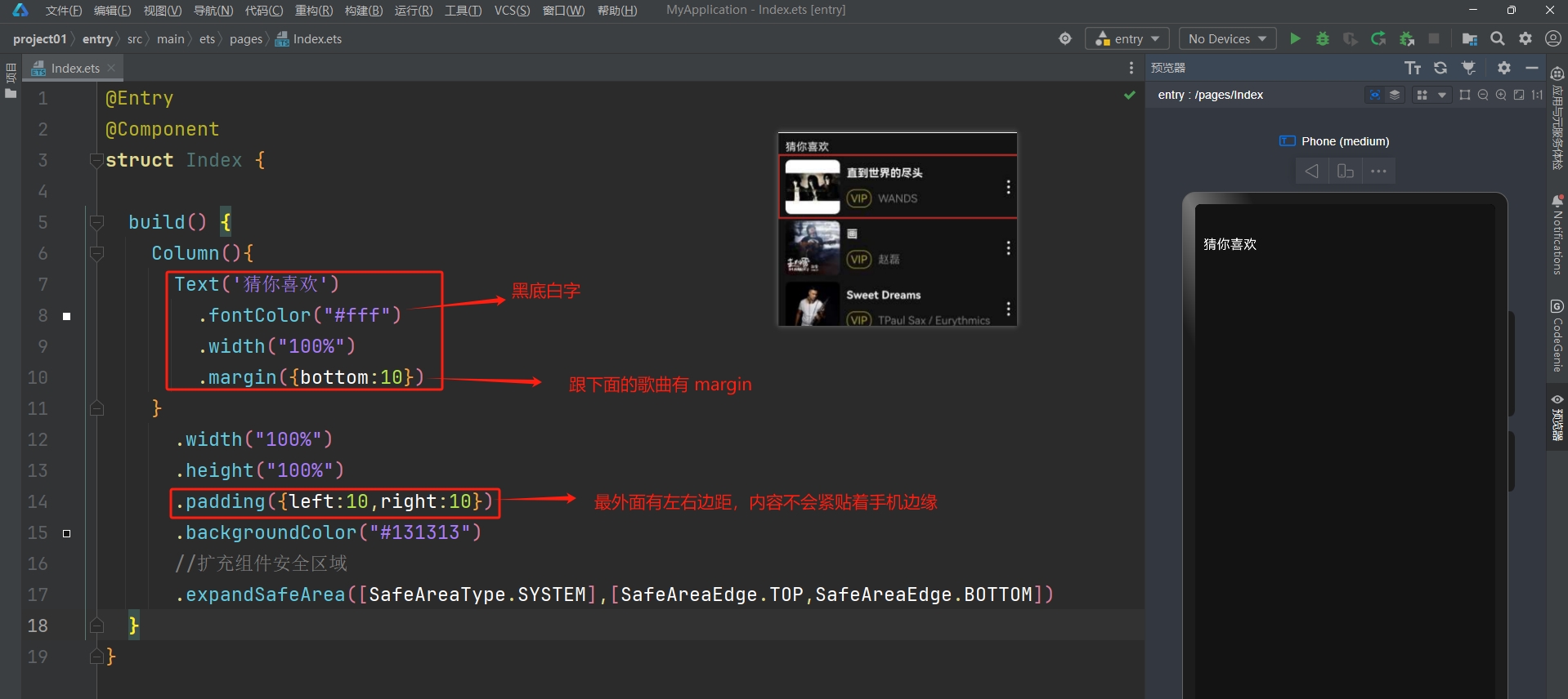
Text('猜你喜欢')
.fontColor("#fff")
.width("100%")
.margin({bottom:10})
}
.width("100%")
.height("100%")
.padding({left:10,right:10})
.backgroundColor("#131313")
//扩充组件安全区域
.expandSafeArea([SafeAreaType.SYSTEM],[SafeAreaEdge.TOP,SafeAreaEdge.BOTTOM])
}
}4.8.4 列表项布局
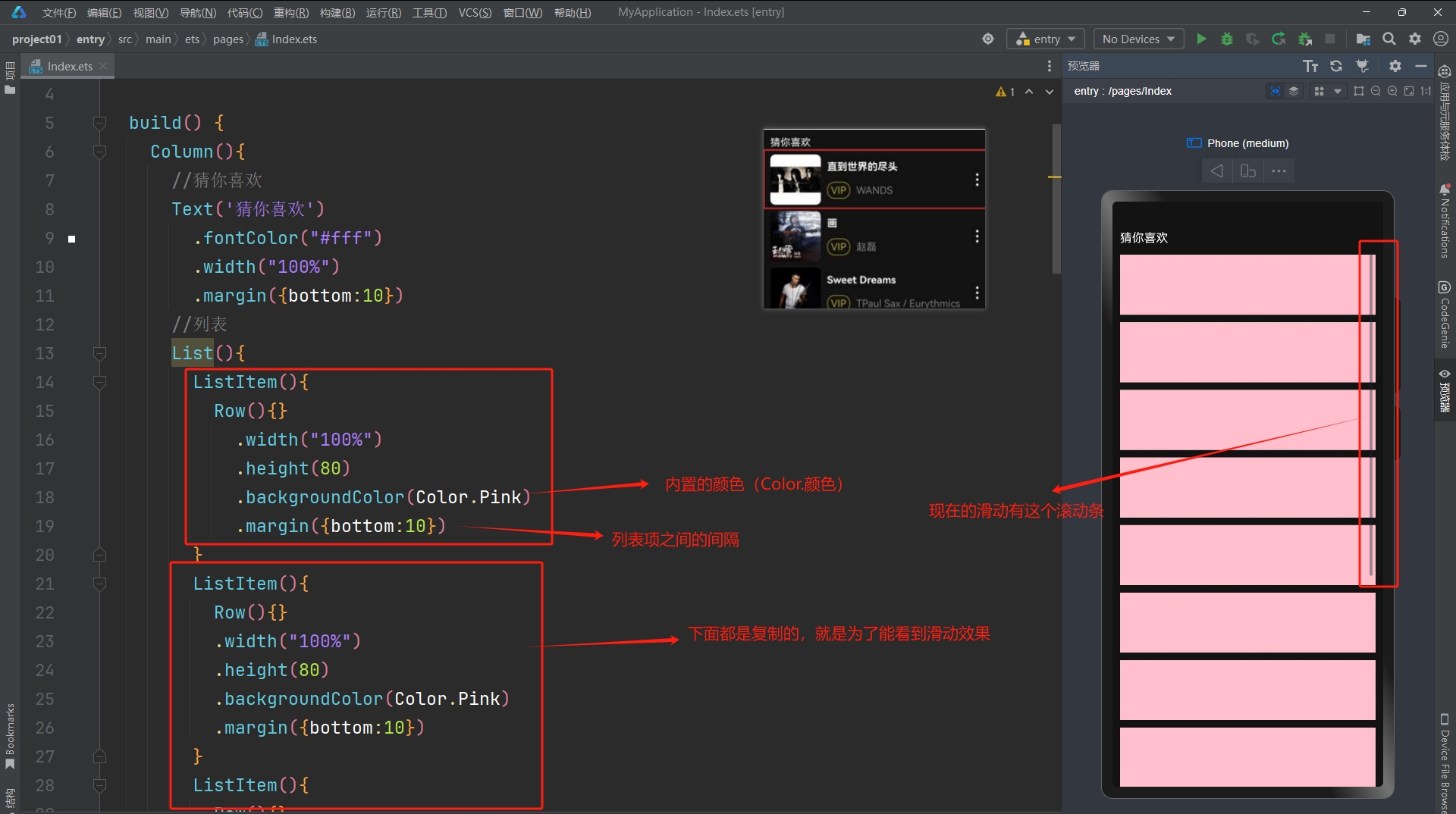
- ❓ 怎么去掉滚动条
.scrollBar(BarState.Off) //不显示滑动条- 现在只是为了展示滑动效果才这么多项,可以先保留一项,就是下面的代码:
List() {
    ListItem() {
        Row() {
        }
        .width("100%")
            .height(80)
            .backgroundColor(Color.Pink)
            .margin({ bottom: 10 })
    }
}
.scrollBar(BarState.Off)//不显示滑动条4.8.5 列表项内容
- 1). 左右两边的图
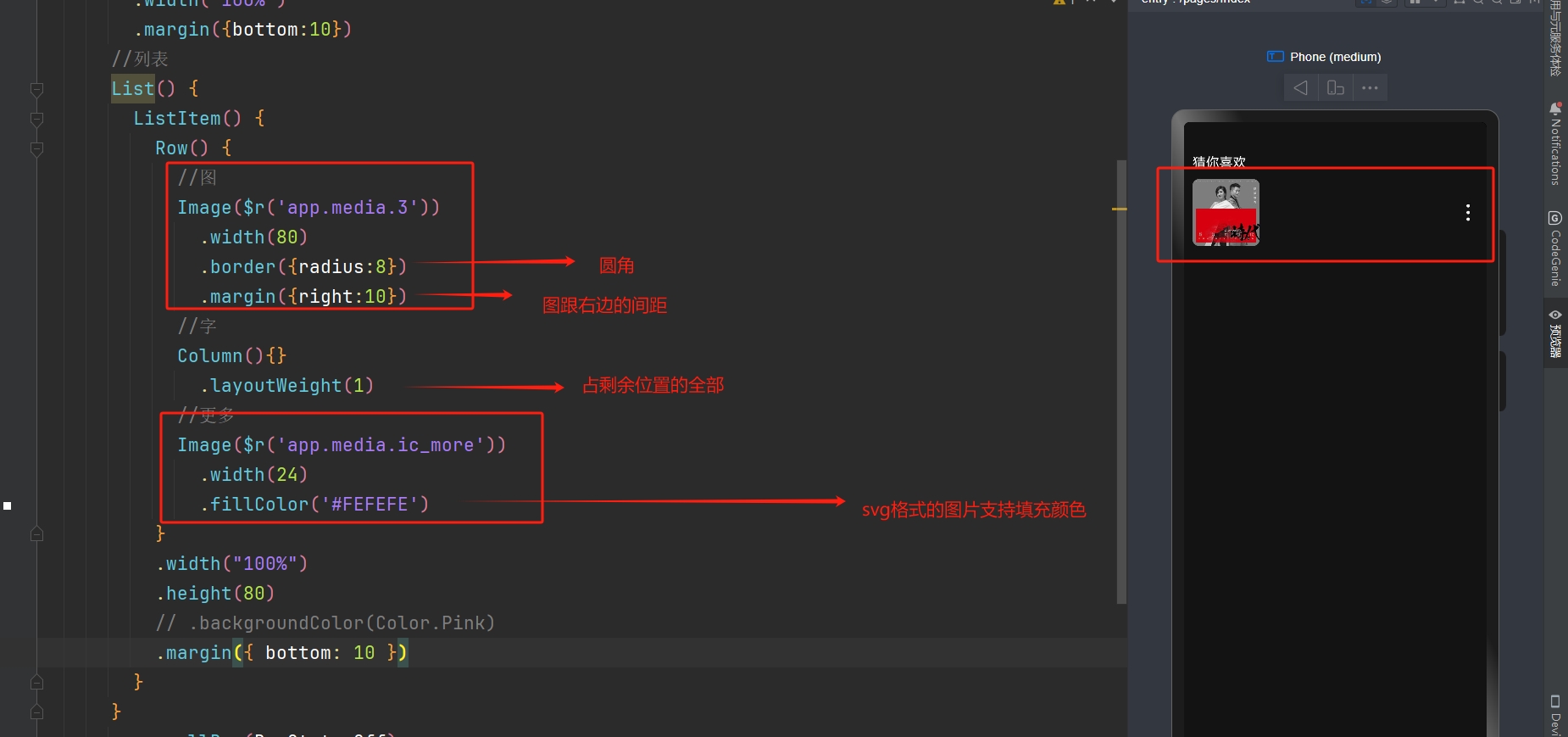
- 回顾:(
4.7说到了layoutWeight(数字)的作用)layWeight(数字)的作用:将外层组件剩余尺寸分成指定份数,当前组件占用对应的份数
- 2). 补充中间的歌曲信息
- 示例代码:
//列表
List() {
    ListItem() {
        Row() {
            //图
            Image($r('app.media.3'))
                .width(80)
                .border({radius:8})
                .margin({right:10})
            //字
            Column(){
                Text('奢香夫人')
                    .fontColor('#F3F3F3')
                    .width('100%')
                    .fontWeight(700)
                    .margin({bottom:15})
                Row(){
                    Text('VIP')
                        .fontColor('#9A8E28')
                        .border({width:1,color:'#9A8E28',radius:12})
                        .padding({left:5,right:5,top:3,bottom:3})
                        .margin({right:10})
                    Text('凤凰传奇')
                        .fontColor('#696969')
                }
                .width('100%')
            }
            .layoutWeight(1)
            //更多
            Image($r('app.media.ic_more'))
                .width(24)
                .fillColor('#FEFEFE')
        }
        .width("100%")
            .height(80)
        // .backgroundColor(Color.Pink)
            .margin({ bottom: 10 })
    }
}
.scrollBar(BarState.Off)- 那么到此就完成了一个歌曲列表项的展示,后续是可以通过
循环渲染来一次性生成多个ListItem的 ...
4.9 if 分支语句
- 场景:
- 根据逻辑条件结果,执行不同的语句
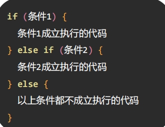
- 后续继续学习还可以知道,根据某个动态数据的值,然后判断条件在当前位置渲染
不同的组件
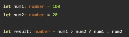
4.10 条件表达式
- 是前面的
if-else的一种简洁的写法,作用一样
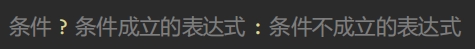
- 示例:
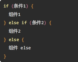
4.11 条件渲染
- 根据逻辑条件结果,渲染出不同的 UI 内容
- 例如:在有商品和没商品的时候,这里展示的按钮是不一样的

- 语法结构:
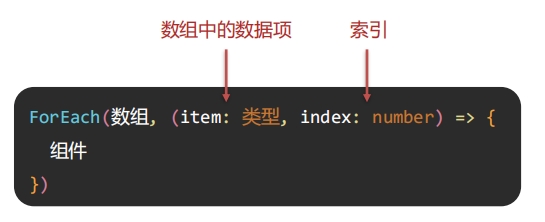
4.12 循环渲染
- 前面我们写了歌曲列表的案例,循环渲染可以帮我们重复渲染 UI 内容
- 做法:把歌曲的数据放到一个
数组里面,然后根据这个数组循环渲染出相同结构的 UI
- 做法:把歌曲的数据放到一个

- 语法:
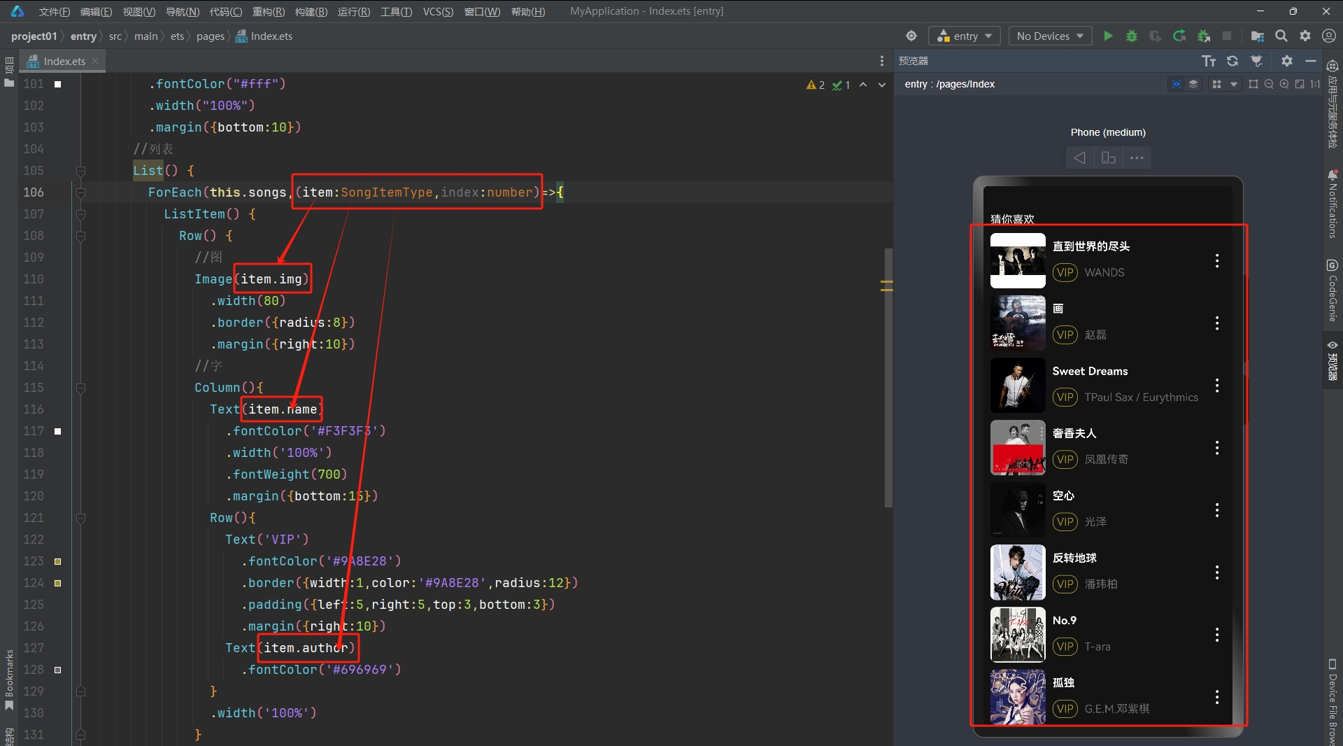
4.13 补全案例 - 循环渲染
- 那么现在就可以补全
4.8的案例的循环渲染部分了
- 歌单数组数据:
songs: SongItemType[] = [
    {
      img: 'http://yjy-teach-oss.oss-cn-beijing.aliyuncs.com/HeimaCloudMusic/0.jpg',
      name: '直到世界的尽头',
      author: 'WANDS',
    },
    {
      img: 'http://yjy-teach-oss.oss-cn-beijing.aliyuncs.com/HeimaCloudMusic/1.jpg',
      name: '画',
      author: '赵磊',
    },
    {
      img: 'http://yjy-teach-oss.oss-cn-beijing.aliyuncs.com/HeimaCloudMusic/2.jpg',
      name: 'Sweet Dreams',
      author: 'TPaul Sax / Eurythmics',
    },
    {
      img: 'http://yjy-teach-oss.oss-cn-beijing.aliyuncs.com/HeimaCloudMusic/3.jpg',
      name: '奢香夫人',
      author: '凤凰传奇',
    },
    {
      img: 'http://yjy-teach-oss.oss-cn-beijing.aliyuncs.com/HeimaCloudMusic/4.jpg',
      name: '空心',
      author: '光泽',
    },
    {
      img: 'http://yjy-teach-oss.oss-cn-beijing.aliyuncs.com/HeimaCloudMusic/5.jpg',
      name: '反转地球',
      author: '潘玮柏',
    },
    {
      img: 'http://yjy-teach-oss.oss-cn-beijing.aliyuncs.com/HeimaCloudMusic/6.jpg',
      name: 'No.9',
      author: 'T-ara',
    },
    {
      img: 'http://yjy-teach-oss.oss-cn-beijing.aliyuncs.com/HeimaCloudMusic/7.jpg',
      name: '孤独',
      author: 'G.E.M.邓紫棋',
    },

    {
      img: 'http://yjy-teach-oss.oss-cn-beijing.aliyuncs.com/HeimaCloudMusic/8.jpg',
      name: 'Lose Control',
      author: 'Hedley',
    },
    {
      img: 'http://yjy-teach-oss.oss-cn-beijing.aliyuncs.com/HeimaCloudMusic/9.jpg',
      name: '倩女幽魂',
      author: '张国荣',
    },
    {
      img: 'http://yjy-teach-oss.oss-cn-beijing.aliyuncs.com/HeimaCloudMusic/10.jpg',
      name: '北京北京',
      author: '汪峰',
    },
    {
      img: 'http://yjy-teach-oss.oss-cn-beijing.aliyuncs.com/HeimaCloudMusic/11.jpg',
      name: '苦笑',
      author: '汪苏泷',
    },
    {
      img: 'http://yjy-teach-oss.oss-cn-beijing.aliyuncs.com/HeimaCloudMusic/12.jpg',
      name: '一生所爱',
      author: '卢冠廷 / 莫文蔚',
    },
    {
      img: 'http://yjy-teach-oss.oss-cn-beijing.aliyuncs.com/HeimaCloudMusic/13.jpg',
      name: '月半小夜曲',
      author: '李克勤',
    },
    {
      img: 'http://yjy-teach-oss.oss-cn-beijing.aliyuncs.com/HeimaCloudMusic/14.jpg',
      name: 'Rolling in the Deep',
      author: 'Adele',
    },
    {
      img: 'http://yjy-teach-oss.oss-cn-beijing.aliyuncs.com/HeimaCloudMusic/15.jpg',
      name: '海阔天空',
      author: 'Beyond',
    }
]- 歌单数据接口:
interface SongItemType{
  img:string  //图像路径
  name:string  //名称
  author:string  //作者
}- 1). 先把
歌曲对象接口&歌曲数组数据写上
- 2). 然后简单的写上
ForEach,看看能不能渲染出多条
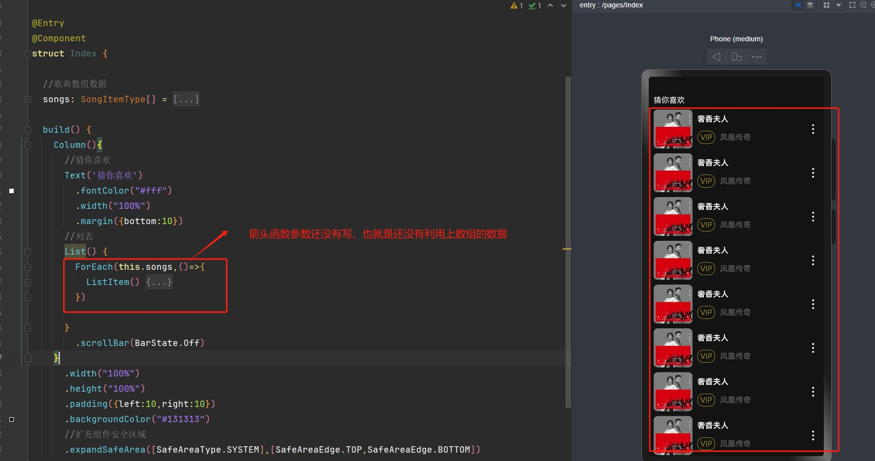
- 3). 补充上箭头函数的参数,利用上数组的数据来渲染
4.14 状态管理 (V2)
说明:
我们学习的是
状态管理 V2,这个会比之前的性能更好,所以我们要把之前在
@Entry下面的那个@Component改成@ComponentV2然后之前说
@State是数据驱动视图的, 那么到了V2对应的是@Local
应用的运行时的状态是参数,当参数
改变时,UI 渲染刷新--> 数据驱动视图状态变量:使用
@local装饰器修饰,状态变量数据改变会引起UI 渲染刷新
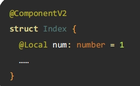
📌 注意:
- 状态必须设置
数据类型 - 状态必须设置
初始值
- 使用状态的时候用
this.状态名
- 那么把上面那个
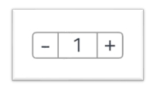
购物车-计数器的代码写一写:- 先给出一个计数器的基础代码(没有绑定事件)
@Entry
@ComponentV2
struct Index {

  build() {
    Column() {
      Row() {
        Text('-')
          .width(40)
          .height(40)
          .border({width: 1, color: '#999', radius: {topLeft: 3, bottomLeft:3}})
          .textAlign(TextAlign.Center)


        Text('10')
          .width(40)
          .height(40)
          .textAlign(TextAlign.Center)
          .border({width: {top: 1, bottom: 1}, color: '#999'})
          .fontSize(18)

        Text('+')
          .width(40)
          .height(40)
          .border({width: 1, color: '#999', radius: {topRight: 3, bottomRight: 3}})
          .textAlign(TextAlign.Center)
      }
      .padding(50)
    }
    .padding(20)
  }
}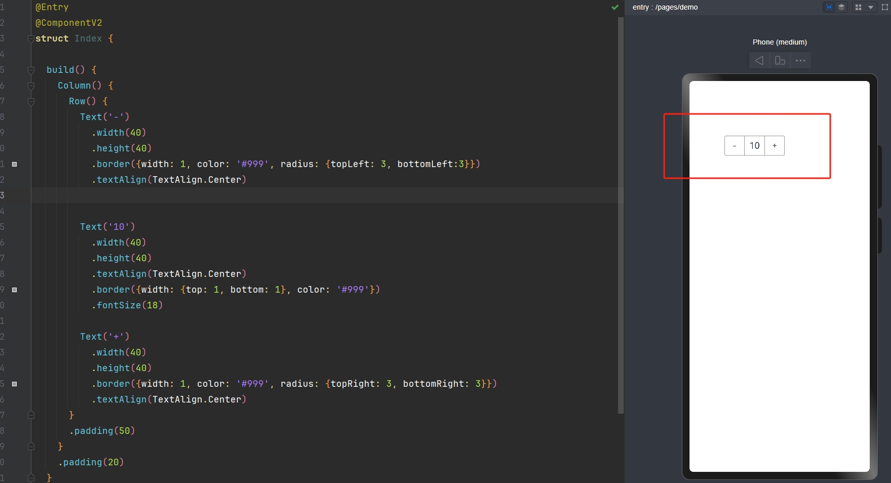
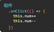
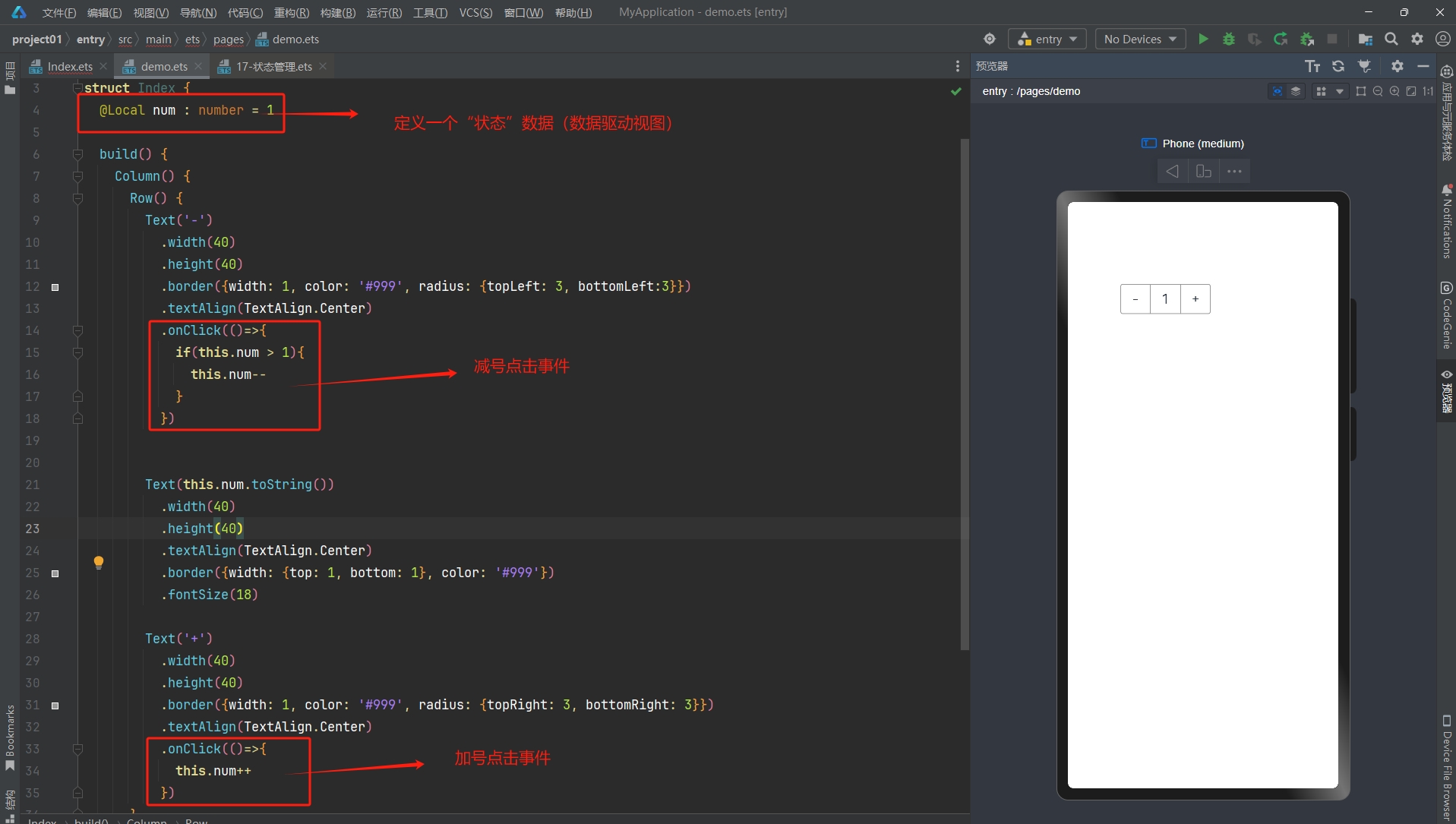
- 接着补充上事件,让它可以
数据驱动视图:
@Entry
@ComponentV2
struct Index {
  @Local num : number = 1

  build() {
    Column() {
      Row() {
        Text('-')
          .width(40)
          .height(40)
          .border({width: 1, color: '#999', radius: {topLeft: 3, bottomLeft:3}})
          .textAlign(TextAlign.Center)
          .onClick(()=>{
            if(this.num > 1){
              this.num--
            }
          })

        Text(this.num.toString())
          .width(40)
          .height(40)
          .textAlign(TextAlign.Center)
          .border({width: {top: 1, bottom: 1}, color: '#999'})
          .fontSize(18)

        Text('+')
          .width(40)
          .height(40)
          .border({width: 1, color: '#999', radius: {topRight: 3, bottomRight: 3}})
          .textAlign(TextAlign.Center)
          .onClick(()=>{
            this.num++
          })
      }
      .padding(50)
    }
    .padding(20)
  }
}
五、ArkTS 核心
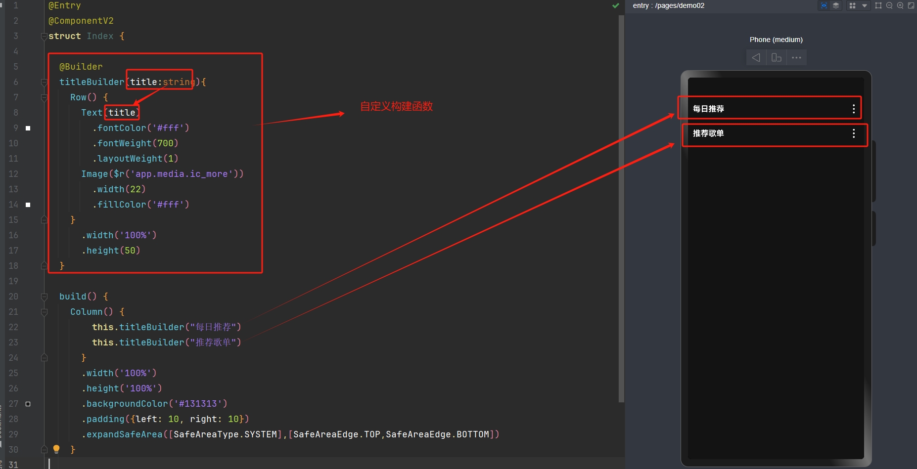
5.1 @Builder 自定义构建函数
使用
@Buider装饰函数,封装 UI 元素,提升复用性比如 :黑马云音乐的这个主页的这两块就是只有文字不同,完全可以封装起来复用

- 定义
自定义构建函数
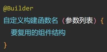
- 调用
自定义构建函数
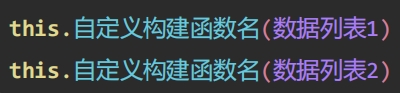
- 使用
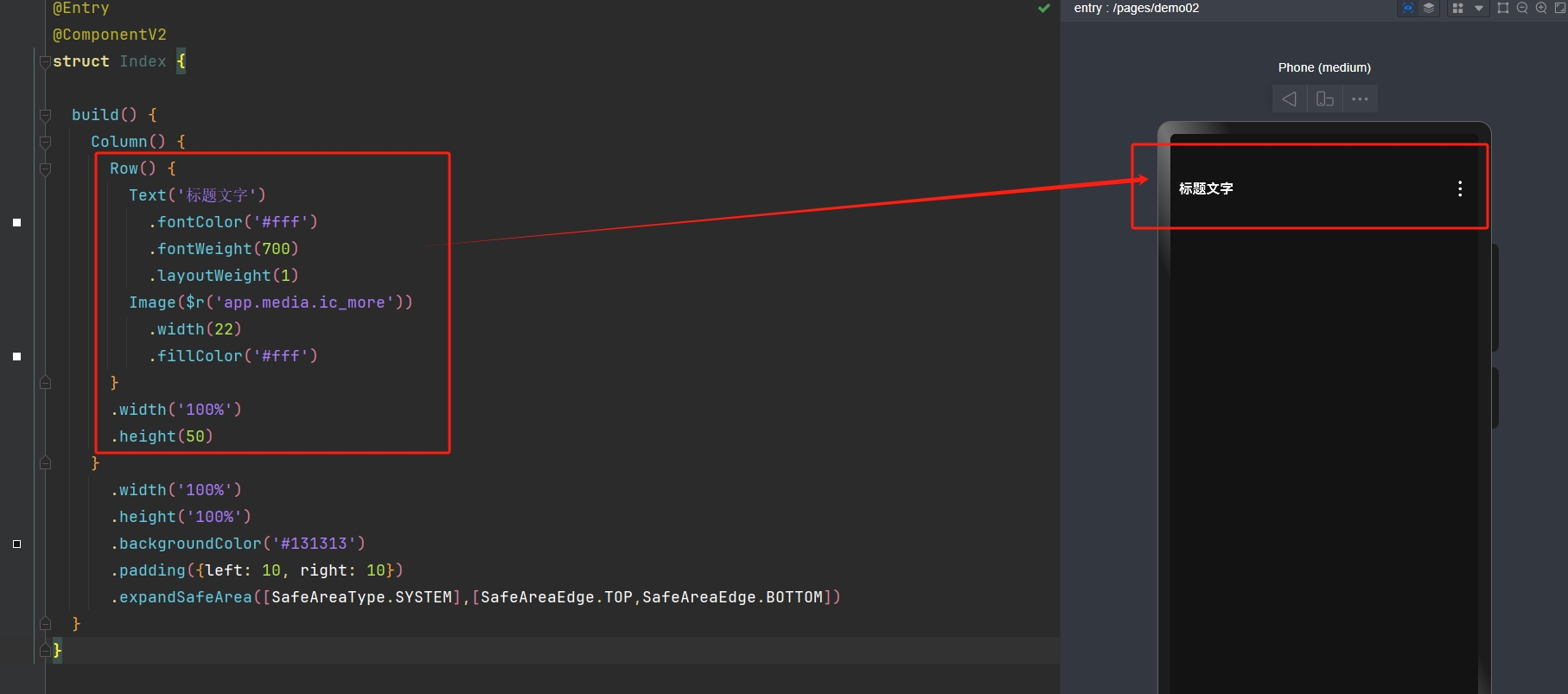
@Builder封装下面示例代码里的Row(),然后调用的时候传参进行复用:
@Entry
@ComponentV2
struct Index {

  build() {
    Column() {
      Row() {
        Text('标题文字')
          .fontColor('#fff')
          .fontWeight(700)
          .layoutWeight(1)
        Image($r('app.media.ic_more'))
          .width(22)
          .fillColor('#fff')
      }
      .width('100%')
      .height(50)
    }
      .width('100%')
      .height('100%')
      .backgroundColor('#131313')
      .padding({left: 10, right: 10})
      .expandSafeArea([SafeAreaType.SYSTEM],[SafeAreaEdge.TOP,SafeAreaEdge.BOTTOM])
  }
}
- 示例代码:
@Entry
@ComponentV2
struct Index {

  @Builder
  titleBuilder(title:string){
    Row() {
      Text(title)
        .fontColor('#fff')
        .fontWeight(700)
        .layoutWeight(1)
      Image($r('app.media.ic_more'))
        .width(22)
        .fillColor('#fff')
    }
      .width('100%')
      .height(50)
  }

  build() {
    Column() {
        this.titleBuilder("每日推荐")
        this.titleBuilder("推荐歌单")
      }
      .width('100%')
      .height('100%')
      .backgroundColor('#131313')
      .padding({left: 10, right: 10})
      .expandSafeArea([SafeAreaType.SYSTEM],[SafeAreaEdge.TOP,SafeAreaEdge.BOTTOM])
    }

}
六、完善案例 - 歌单交互效果
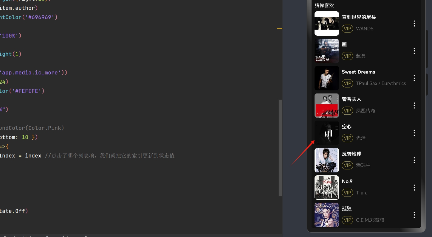
- 对于这个案例,前面我们已经做到了上图这个效果,我们还需要把它改成下面的效果:
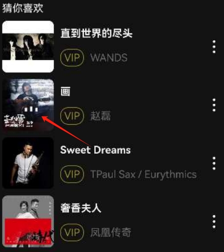
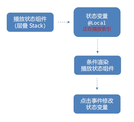
- 也就是点击哪个音乐,哪个音乐就播放动态效果,下面来梳理一下怎么实现这个功能:
1). 首先,这个效果其实是用
层叠组件 Stack实现的2). 其次前面我们学了状态管理,那么我们就可以给每一个列表项增加
点击事件,点击了哪个列表项,我们就把它的索引更新到状态值里
3). 那么我们再根据状态来添加
条件渲染就可以把这个动态效果指定到某一个歌曲上了
- 示例代码:
//歌曲对象的接口
interface SongItemType{
img:string //图像路径
name:string //名称
author:string //作者
}
@Entry
@ComponentV2
struct Index {
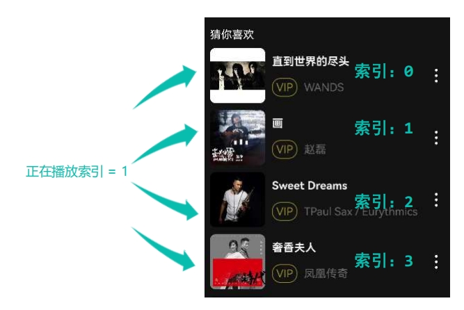
@Local playIndex:number = -1 // 先设置成不对应任何索引,后面再指定
//歌曲数组数据
songs: SongItemType[] = [
{
img: 'http://yjy-teach-oss.oss-cn-beijing.aliyuncs.com/HeimaCloudMusic/0.jpg',
name: '直到世界的尽头',
author: 'WANDS',
},
{
img: 'http://yjy-teach-oss.oss-cn-beijing.aliyuncs.com/HeimaCloudMusic/1.jpg',
name: '画',
author: '赵磊',
},
{
img: 'http://yjy-teach-oss.oss-cn-beijing.aliyuncs.com/HeimaCloudMusic/2.jpg',
name: 'Sweet Dreams',
author: 'TPaul Sax / Eurythmics',
},
{
img: 'http://yjy-teach-oss.oss-cn-beijing.aliyuncs.com/HeimaCloudMusic/3.jpg',
name: '奢香夫人',
author: '凤凰传奇',
},
{
img: 'http://yjy-teach-oss.oss-cn-beijing.aliyuncs.com/HeimaCloudMusic/4.jpg',
name: '空心',
author: '光泽',
},
{
img: 'http://yjy-teach-oss.oss-cn-beijing.aliyuncs.com/HeimaCloudMusic/5.jpg',
name: '反转地球',
author: '潘玮柏',
},
{
img: 'http://yjy-teach-oss.oss-cn-beijing.aliyuncs.com/HeimaCloudMusic/6.jpg',
name: 'No.9',
author: 'T-ara',
},
{
img: 'http://yjy-teach-oss.oss-cn-beijing.aliyuncs.com/HeimaCloudMusic/7.jpg',
name: '孤独',
author: 'G.E.M.邓紫棋',
},
{
img: 'http://yjy-teach-oss.oss-cn-beijing.aliyuncs.com/HeimaCloudMusic/8.jpg',
name: 'Lose Control',
author: 'Hedley',
},
{
img: 'http://yjy-teach-oss.oss-cn-beijing.aliyuncs.com/HeimaCloudMusic/9.jpg',
name: '倩女幽魂',
author: '张国荣',
},
{
img: 'http://yjy-teach-oss.oss-cn-beijing.aliyuncs.com/HeimaCloudMusic/10.jpg',
name: '北京北京',
author: '汪峰',
},
{
img: 'http://yjy-teach-oss.oss-cn-beijing.aliyuncs.com/HeimaCloudMusic/11.jpg',
name: '苦笑',
author: '汪苏泷',
},
{
img: 'http://yjy-teach-oss.oss-cn-beijing.aliyuncs.com/HeimaCloudMusic/12.jpg',
name: '一生所爱',
author: '卢冠廷 / 莫文蔚',
},
{
img: 'http://yjy-teach-oss.oss-cn-beijing.aliyuncs.com/HeimaCloudMusic/13.jpg',
name: '月半小夜曲',
author: '李克勤',
},
{
img: 'http://yjy-teach-oss.oss-cn-beijing.aliyuncs.com/HeimaCloudMusic/14.jpg',
name: 'Rolling in the Deep',
author: 'Adele',
},
{
img: 'http://yjy-teach-oss.oss-cn-beijing.aliyuncs.com/HeimaCloudMusic/15.jpg',
name: '海阔天空',
author: 'Beyond',
}
]
build() {
Column(){
//猜你喜欢
Text('猜你喜欢')
.fontColor("#fff")
.width("100%")
.margin({bottom:10})
//列表
List() {
ForEach(this.songs,(item:SongItemType,index:number)=>{
ListItem() {
Row() {
//图
Stack(){
Image(item.img)
.width(80)
.border({radius:8})
.margin({right:10})
//条件渲染
if(this.playIndex === index){
Image($r('app.media.wave'))
.width(24)
}
}
//字
Column(){
Text(item.name)
.fontColor('#F3F3F3')
.width('100%')
.fontWeight(700)
.margin({bottom:15})
Row(){
Text('VIP')
.fontColor('#9A8E28')
.border({width:1,color:'#9A8E28',radius:12})
.padding({left:5,right:5,top:3,bottom:3})
.margin({right:10})
Text(item.author)
.fontColor('#696969')
}
.width('100%')
}
.layoutWeight(1)
//更多
Image($r('app.media.ic_more'))
.width(24)
.fillColor('#FEFEFE')
}
.width("100%")
.height(80)
// .backgroundColor(Color.Pink)
.margin({ bottom: 10 })
.onClick(()=>{
this.playIndex = index //点击了哪个列表项,我们就把它的索引更新到状态值
})
}
})
}
.scrollBar(BarState.Off)
}
.width("100%")
.height("100%")
.padding({left:10,right:10})
.backgroundColor("#131313")
//扩充组件安全区域
.expandSafeArea([SafeAreaType.SYSTEM],[SafeAreaEdge.TOP,SafeAreaEdge.BOTTOM])
}
}- 效果:
七、黑马云音乐
7.1 创建模拟器&运行项目
- 流程概览:
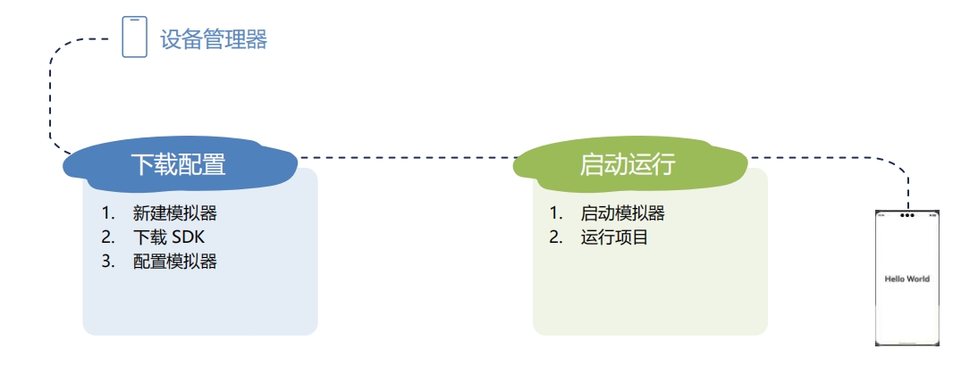
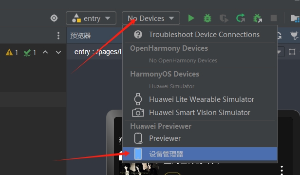
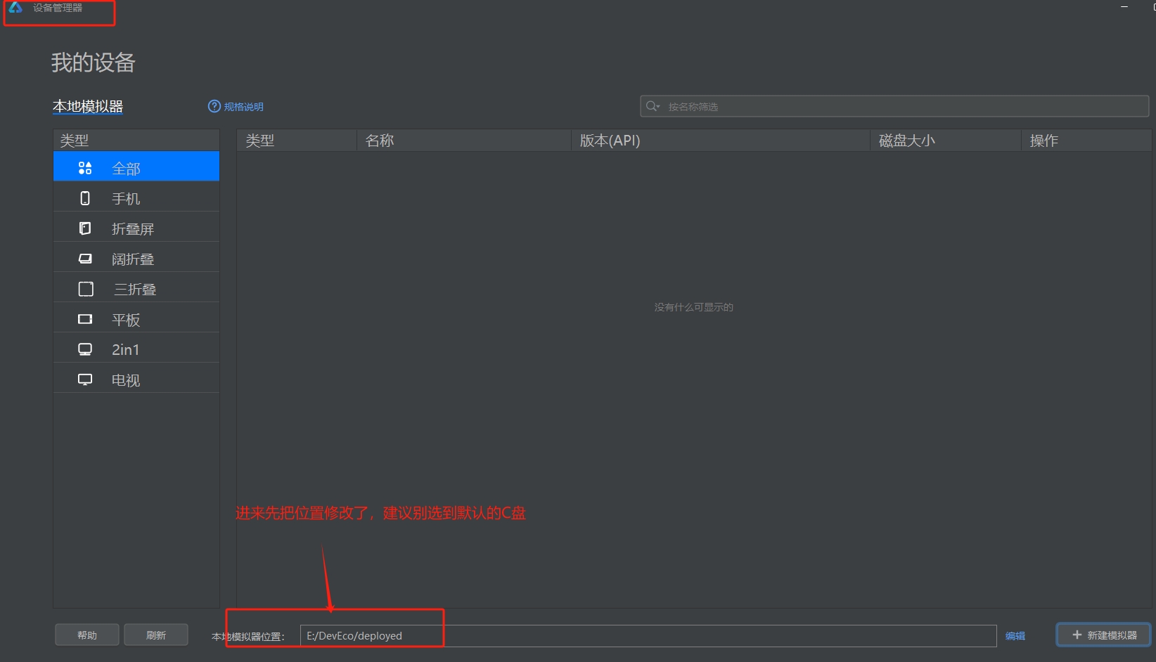
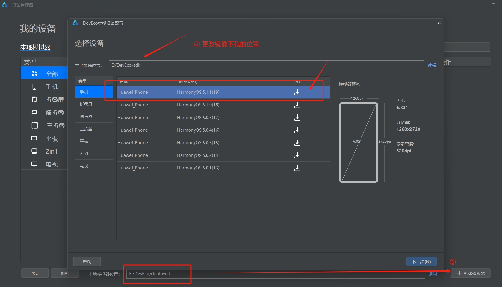
- 1). 设备管理器:(一开始
No Devices)
- 2). 更改模拟器位置:
- 3). 更改下载系统镜像位置:
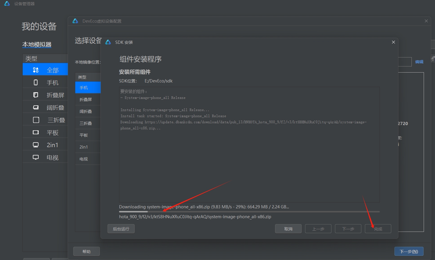
- 4). 等待安装完成
- 5). 可能会遇到下面
没开启虚拟化支持的错误
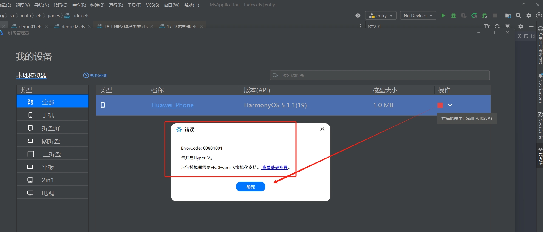
- 按照官方文档处理:https://developer.huawei.com/consumer/cn/doc/harmonyos-guides/ide-emulator-faqs#section214296171615
- 6). 打开虚拟化支持,重启电脑后,就可以顺利打开设备:
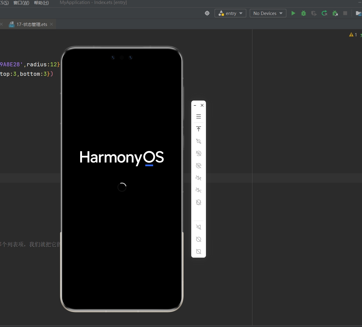
- 7). 运行目前
@Entry项目到设备上:
- 8). 运行好后会发现图片没法显示,这是正常的,因为都是网络图片,我们还没开网络权限
- 9). 我们可以把模拟器设置置顶,方便后面调试
- 10). 修改软件图标&名称:
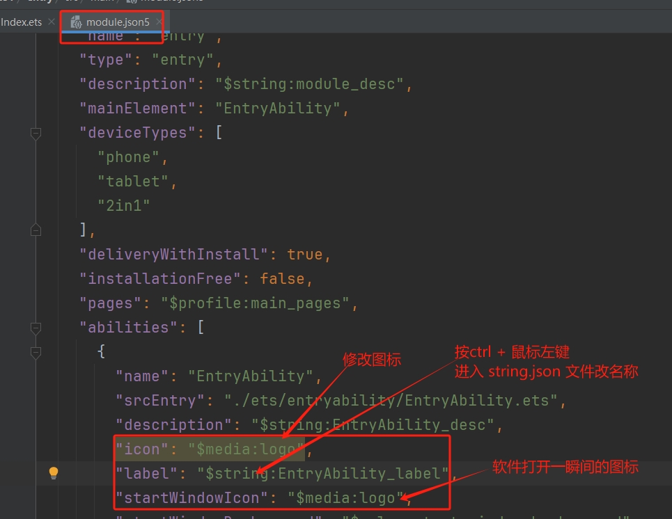
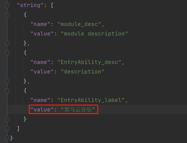
重启项目,图标和名称都改变了
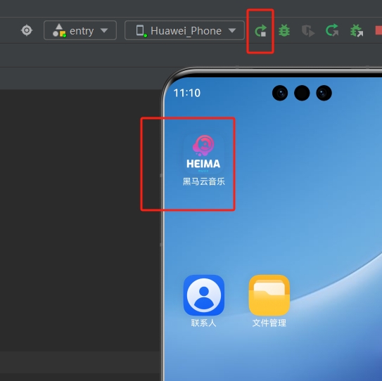
有时候可能会没刷新过来,那么只需要长按卸载,然后再运行一次就好了...
7.2 Navigation 组件
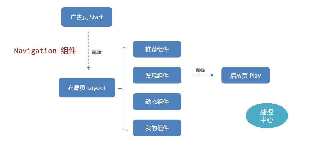
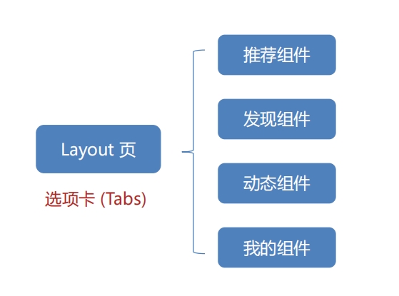
- 项目功能结构:
- 使用
Navigation组件来实现页面跳转
- 官方文档对应位置:https://developer.huawei.com/consumer/cn/doc/harmonyos-guides/arkts-navigation-navigation#系统路由表
📌 官方文档:
- 跨包路由:
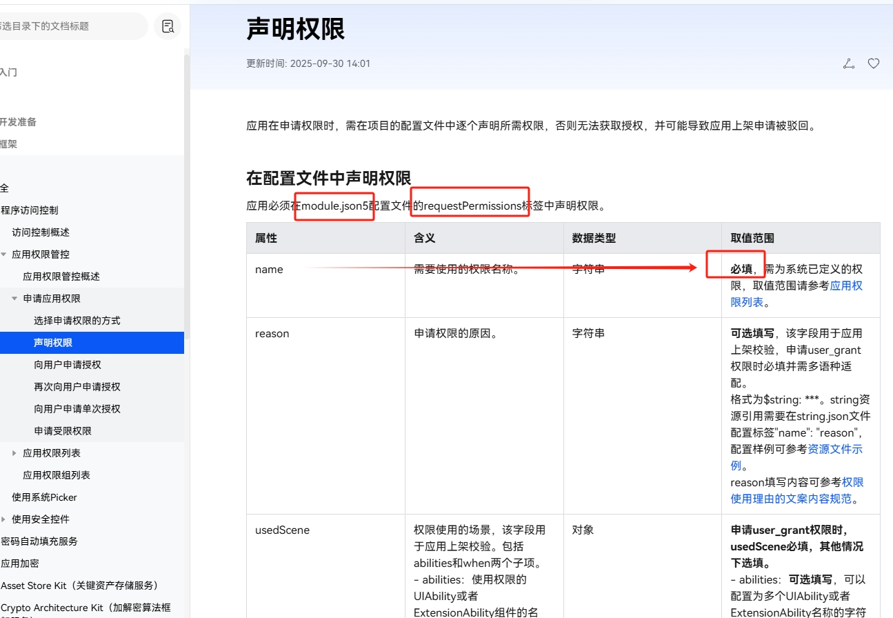
- 系统路由表相对自定义路由表,使用更简单,只需要添加对应页面跳转配置项,即可实现页面跳转。
- 自定义路由表使用起来更复杂,但是可以根据应用业务进行定制处理。
支持自定义路由表和系统路由表混用。
- 路由表能力对比:
不同路由方式适用于不同需求,易用性或可扩展性需根据项目特点权衡选择。
| 路由方式 | 跨包跳转能力 | 可扩展性 | 易用性 |
|---|---|---|---|
| 系统路由表 | 跳转前无需 import 页面文件,页面按需动态加载 | 可扩展性一般 | 易用性更强 系统自动维护路由表 |
| 自定义路由表 | 跳转前需要 import 页面文件 | 可扩展性更强 | 易用性一般 需要开发者自行维护路由表 |
- ❗
这个项目只使用系统路由表来实现
- 系统路由表:
系统路由表是动态路由的一种实现方式。从
API version 12开始,Navigation支持使用系统路由表的方式进行动态路由。各业务模块(HSP/HAR)中需要独立配置
route_map.json文件,在触发路由跳转时,应用只需要通过
NavPathStack提供的路由方法,传入需要路由的页面配置名称,此时系统会自动完成路由模块的动态加载、页面组件构建,并完成路由跳转,从而实现了开发层面
的模块解耦。系统路由表支持模拟器但不支持预览器。其主要步骤如下:
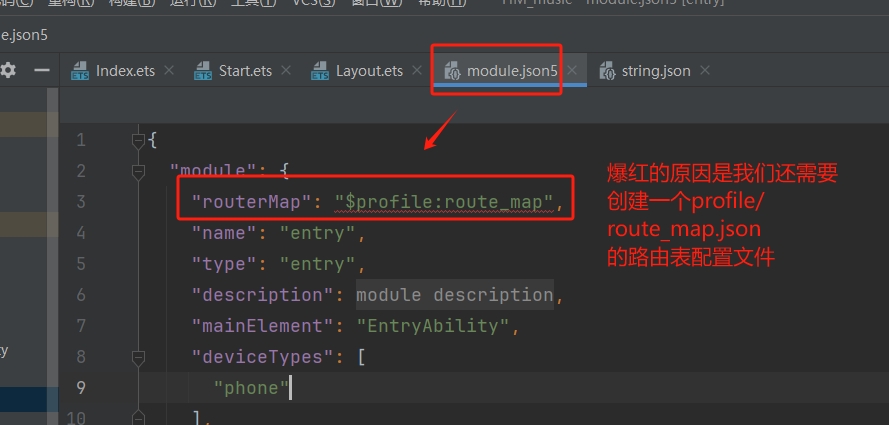
- 1). 在跳转目标模块的配置文件 module.json5 添加路由表配置:
{
    "module" : {
        "routerMap": "$profile:route_map"
    }
}2). 添加完路由配置文件地址后,需要在工程
resources/base/profile中创建route_map.json文件。添加如下配置信息:
{
    "routerMap": [
        {
            "name": "PageOne",
            "pageSourceFile": "src/main/ets/pages/PageOne.ets",
            "buildFunction": "PageOneBuilder",
            "data": {
                "description" : "this is PageOne"
            }
        }
    ]
}- 配置说明如下:
| 配置项 | 说明 |
|---|---|
name | 可自定义的跳转页面名称 |
pageSourceFile | 跳转目标页在包内的入口函数名称,必须以@Builder 修饰 |
buildFunction | 跳转目标页的入口函数名称,必须以 @Builder 修饰 |
data | 应用自定义字段。可以通过配置项读取接口 getConfigRouteMap 获取 |
3). 在跳转目标页面中,需要配置入口
Builder函数,函数名称需要和route_map.json配置文件中的
buildFunction保持一致,否则在编译时会报错。
// 跳转页面入口函数
@Builder
export function PageOneBuilder() {
    PageOne();
}

@Component
struct PageOne {
    pathStack: NavPathStack = new NavPathStack();

    build() {
        NavDestination() {
        }
        .title('PageOne')
            .onReady((context: NavDestinationContext) => {
            this.pathStack = context.pathStack;
        })
    }
}4). 通过
pushPathByName等路由接口进行页面跳转。(注意:此时
Navigation中可以不用配置navDestination属性。)
@Entry
@Component
struct Index {
pageStack : NavPathStack = new NavPathStack();
build() {
Navigation(this.pageStack){
}.onAppear(() => {
this.pageStack.pushPathByName("PageOne", null, false);
})
.hideNavBar(true)
}
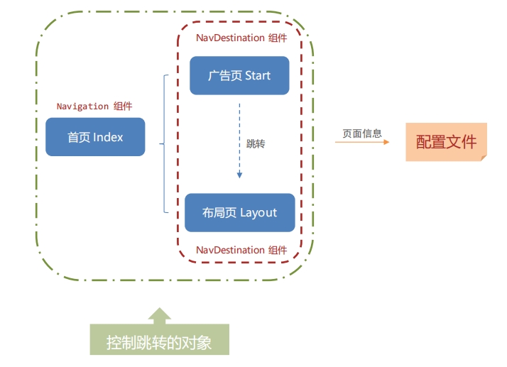
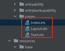
}- 1). 根据上面的项目结构:我们需要新建两个子页面
广告页 Start.ets&布局页 Layout.ets
- 2). 子页
广告页 Start.ets写上官方示例代码并做对应修改(对应文档第三步):
// 跳转页面入口函数
@Builder
export function StartBuilder() {
  Start();
}

@Component
struct Start {
  //控制跳转的对象
  pathStack: NavPathStack = new NavPathStack();

  build() {
    NavDestination() {
    }
    .title('广告页')
    .onReady((context: NavDestinationContext) => {
      //当组件准备好的时候,把自己放进控制跳转对象里,那么自己就是能跳转的对象之一
      this.pathStack = context.pathStack;
    })
  }
}- 3). 子页
布局页 Layout.ets写上官方示例代码并做对应修改(对应文档第三步):
// 跳转页面入口函数
@Builder
export function LayoutBuilder() {
  Layout();
}

@Component
struct Layout {
  //控制跳转的对象
  pathStack: NavPathStack = new NavPathStack();

  build() {
    NavDestination() {
    }
    .title('布局页')
    .onReady((context: NavDestinationContext) => {
      //当组件准备好的时候,把自己放进控制跳转对象里,那么自己就是能跳转的对象之一
      this.pathStack = context.pathStack;
    })
  }
}- 4). 在
module.json5添加路由表配置:(对应官方文档第一步)
5). 在工程
resources/base/profile中创建route_map.json文件。添加如下配置信息:(对应官方文档第二步)
{
  "routerMap": [
    {
      "name": "Start",
      "pageSourceFile": "src/main/ets/pages/Start.ets",
      "buildFunction": "StartBuilder",
      "data": {
        "description" : "this is Start"
      }
    },
    {
      "name": "Layout",
      "pageSourceFile": "src/main/ets/pages/Layout.ets",
      "buildFunction": "LayoutBuilder",
      "data": {
        "description" : "this is Layout"
      }
    }

  ]
}- 6). 在导航页
index.ets写上官方示例代码并做对应修改(对应文档第四步):
@Entry
@Component
struct Index {
  //我们在子页的跳转对象叫 pathStack , 所以这里也注意修改成 pathStack
  pathStack : NavPathStack = new NavPathStack();

  build() {
    Navigation(this.pathStack){
    }.onAppear(() => {
      //通过名称Name推路径(其实就是跳转页面)
      //软件一打开应当打开的是广告页,所以跳转
      this.pathStack.pushPathByName("Start", null, false);
    })
    .hideNavBar(true) //不会把自己放到控制跳转对象(本质是不会进Stack栈)里面 -> 点返回不会返回到这个导航页
  }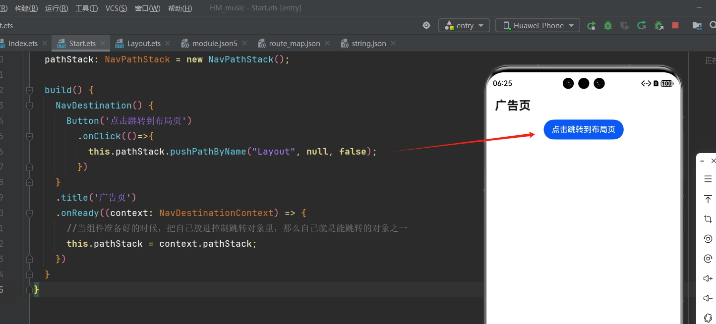
}- 7). 在广告页写一个跳转按钮测试一下能不能跳转到布局页:
// 跳转页面入口函数
@Builder
export function StartBuilder() {
  Start();
}

@Component
struct Start {
  //控制跳转的对象
  pathStack: NavPathStack = new NavPathStack();

  build() {
    NavDestination() {
      Button('点击跳转到布局页')
        .onClick(()=>{
          this.pathStack.pushPathByName("Layout", null, false);
        })
    }
    .title('广告页')
    .onReady((context: NavDestinationContext) => {
      //当组件准备好的时候,把自己放进控制跳转对象里,那么自己就是能跳转的对象之一
      this.pathStack = context.pathStack;
    })
  }
}- 8). 然后打开模拟器,运行项目,查看效果(预览器是不能使用
Navigation的):
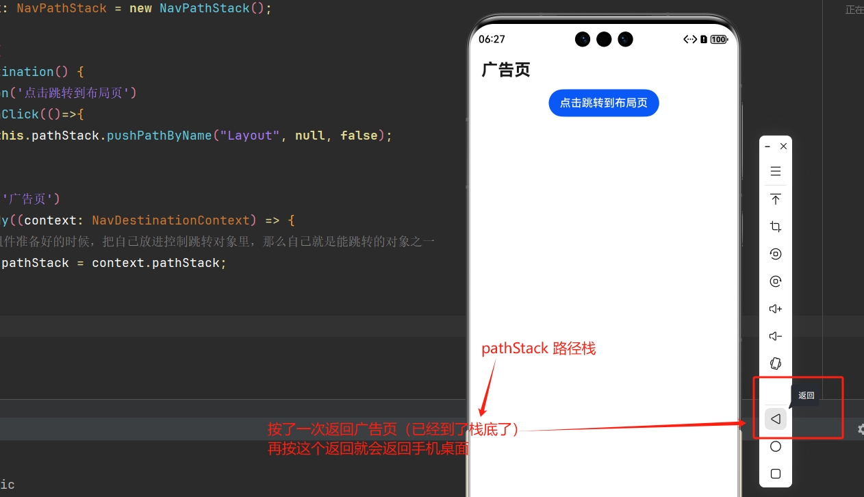
回顾前面有一句代码
.hideNavBar(true)就表面没把index.ets放到路径栈里面
7.3 广告页
- 达成效果:(图片和按钮层叠布局,如果没点按钮,那么 3 秒后自动跳转)

- 示例代码:
// 跳转页面入口函数
@Builder
export function StartBuilder() {
  Start();
}

@Component
struct Start {
  //控制跳转的对象
  pathStack: NavPathStack = new NavPathStack();

  //计时器ID
  private timerId : number|null = null

  //过3秒后自动跳转到 Layout --> Start 页面打开后就计时3秒
  aboutToAppear(): void { //生命周期
    this.timerId = setTimeout(()=>{
      this.pathStack.replacePathByName("Layout", null, false);
    },3000)  //毫秒为单位
  }

  build() {
    NavDestination() {
      Stack({alignContent:Alignment.TopEnd}){
        //广告图
        Image($r('app.media.ad'))
          .width('100%')
          .height('100%')
          //扩充安全区
          .expandSafeArea([SafeAreaType.SYSTEM],[SafeAreaEdge.TOP,SafeAreaEdge.BOTTOM])
        //右上角跳过按钮
        Button('跳过')
          .backgroundColor(Color.Grey)
          .margin(15)
          .onClick(()=>{
            //点击了后清除计时器
            if(this.timerId !== null){
              clearTimeout(this.timerId)
              this.timerId = null
            }
            //广告页不支持返回, 一开始展示后就要出栈,用布局页replace
            this.pathStack.replacePathByName("Layout", null, false);
          })
      }

    }
    // .title('广告页')
    .onReady((context: NavDestinationContext) => {
      //当组件准备好的时候,把自己放进控制跳转对象里,那么自己就是能跳转的对象之一
      this.pathStack = context.pathStack;
    })
  }
}📌 说明:
aboutToAppear(): void {
    setTimeout(()=>{
      //页面跳转代码
    },3000)  //毫秒为单位
}- 1). 上面代码块中,核心代码作用是什么 ❓
- 组件即将显示时,
build()函数执行前 :执行生命周期函数aboutToAppear() setTimeout(回调函数,毫秒数)延迟第二个参数的毫秒数,然后执行回调函数
- 组件即将显示时,
- 2).
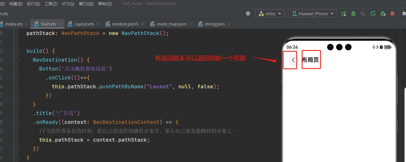
replacePathByName&pushPathByName的区别是什么 ❓- 前者不支持返回,后者支持返回
- 3).
Stack层叠容器组件如何调整内容对齐方式 ❓
Stack({alignContent:Alignment.TopEnd}){}7.3 布局页
7.3.1 Tabs 选项卡
- 功能结构:
Tabs组件 :
- 示例代码:
//tab栏菜单接口
interface TabClass {
text: string
icon: ResourceStr
}
// 跳转页面入口函数
@Builder
export function LayoutBuilder() {
Layout();
}
@Component
struct Layout {
//控制跳转的对象
pathStack: NavPathStack = new NavPathStack();
//tab栏菜单数组
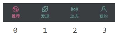
tabData: TabClass[] = [
{text: '推荐', icon: $r('app.media.ic_recommend')},
{text: '发现', icon: $r('app.media.ic_find')},
{text: '动态', icon: $r('app.media.ic_moment')},
{text: '我的', icon: $r('app.media.ic_mine')}
]
//自定义导航栏
@Builder tabBuilder(item:TabClass){
//上图下字,用Column
Column({space:5}){
Image(item.icon)
.width(24)
.fillColor('#63AAAA')
Text(item.text)
.fontSize(14)
.fontColor('#63AAAA')
}
}
build() {
NavDestination() {
Tabs({barPosition:BarPosition.End}){
ForEach(this.tabData,(item:TabClass , index:number)=>{
TabContent(){
Text('内容')
.fontColor('#FFF')
}
.tabBar(this.tabBuilder(item)) //自定义导航栏 --> 需要用 @Builder
.backgroundColor('#131215')
.expandSafeArea([SafeAreaType.SYSTEM],[SafeAreaEdge.TOP,SafeAreaEdge.BOTTOM])
})
}
.backgroundColor('#3B3F42')
.expandSafeArea([SafeAreaType.SYSTEM],[SafeAreaEdge.TOP,SafeAreaEdge.BOTTOM])
}
// .title('布局页')
.onReady((context: NavDestinationContext) => {
//当组件准备好的时候,把自己放进控制跳转对象里,那么自己就是能跳转的对象之一
this.pathStack = context.pathStack;
})
}
}📌 说明:
Tabs组件:
Tabs({barPosition:BarPosition.End}){
    TabContent(){
        Text('内容')
    }
    .tabBar('菜单')
})Column(){}&Row(){}的小括号里面可以填参数space调整组件间距
Column({space:5}){ //组件间距为5
}- 自定义导航栏:
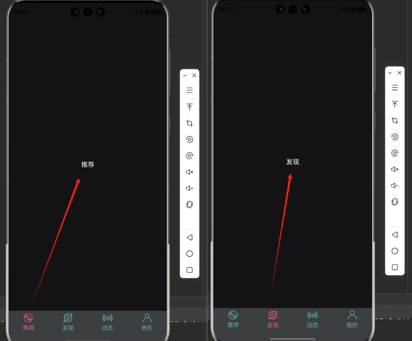
.tabBar(this.Builder函数)7.3.2 Tabs 交互
- 两个任务:
- 1). 菜单默认高亮
- 2). 切换功能
- 选中的菜单高亮
- 内容切换:
条件渲染不同组件
- 示例效果:
- 示例代码:
import { Find } from "./Find";
import { Mine } from "./Mine";
import { Moment } from "./Moment";
import { Recommend } from "./Recommend";

//tab栏菜单接口
interface TabClass {
  text: string
  icon: ResourceStr
}

// 跳转页面入口函数
@Builder
export function LayoutBuilder() {
  Layout();
}

@ComponentV2
struct Layout {
  //默认是索引为0的位置,所以默认值为 0
  @Local currentIndex : number = 0

  //控制跳转的对象
  pathStack: NavPathStack = new NavPathStack();

  //tab栏菜单数组
  tabData: TabClass[] = [
    {text: '推荐', icon: $r('app.media.ic_recommend')},
    {text: '发现', icon: $r('app.media.ic_find')},
    {text: '动态', icon: $r('app.media.ic_moment')},
    {text: '我的', icon: $r('app.media.ic_mine')}
  ]

  @Builder tabBuilder(item:TabClass,index:number){
    //上图下字,用Column
    Column({space:5}){
      Image(item.icon)
        .width(24)
        .fillColor(this.currentIndex === index ? '#E85A88' : '#63AAAA')
      Text(item.text)
        .fontSize(14)
        .fontColor(this.currentIndex === index ? '#E85A88' : '#63AAAA')
    }
  }

  build() {
    NavDestination() {
      Tabs({barPosition:BarPosition.End}){
        ForEach(this.tabData,(item:TabClass , index:number)=>{
          TabContent(){
            //条件渲染
            if(this.currentIndex === 0){
              Recommend()
            }else if(this.currentIndex === 1){
              Find()
            }else if(this.currentIndex === 2){
              Moment()
            }else{
              Mine()
            }
          }
          .tabBar(this.tabBuilder(item,index)) //自定义导航栏 --> 需要用 @Builder
          .backgroundColor('#131215')
          .expandSafeArea([SafeAreaType.SYSTEM],[SafeAreaEdge.TOP,SafeAreaEdge.BOTTOM])
        })
      }
      .onChange((index:number)=>{
        this.currentIndex = index //点到哪个菜单就更新 currentIndex 状态
      })
      .backgroundColor('#3B3F42')
      .expandSafeArea([SafeAreaType.SYSTEM],[SafeAreaEdge.TOP,SafeAreaEdge.BOTTOM])
    }
    // .title('布局页')
    .onReady((context: NavDestinationContext) => {
      //当组件准备好的时候,把自己放进控制跳转对象里,那么自己就是能跳转的对象之一
      this.pathStack = context.pathStack;
    })
  }
}📌 说明:
- 1).
Tabs栏 切换会触发onChange()事件:
Tabs({barPosition:BarPosition.End}){
}
    .onChange((index:number)=>{
        //点击或滑动触发。index 对应切换到的菜单索引
    })
- 2). 使用状态管理来实现交互功能:

@ComponentV2
struct Layout {
  //默认是索引为0的位置,所以默认值为 0
  @Local currentIndex : number = 0
    ...
}.onChange((index:number)=>{
this.currentIndex = index //点到哪个菜单就更新 currentIndex 状态
}).fillColor(this.currentIndex === index ? '#E85A88' : '#63AAAA')- 3). 每个切换到的内容新建
.ets文件自定义组件然后用export导出:(Recommend.ets示例)
@Component
//export 导出,其它组件才能使用
export struct Recommend {
  build() {
    Text('推荐')
      .fontColor('#FFF')
  }
}- 4). 在
TabContent部分条件渲染出对应组件:
TabContent(){
    //条件渲染
    if(this.currentIndex === 0){
        Recommend()
    }else if(this.currentIndex === 1){
        Find()
    }else if(this.currentIndex === 2){
        Moment()
    }else{
        Mine()
    }
}7.4 推荐组件
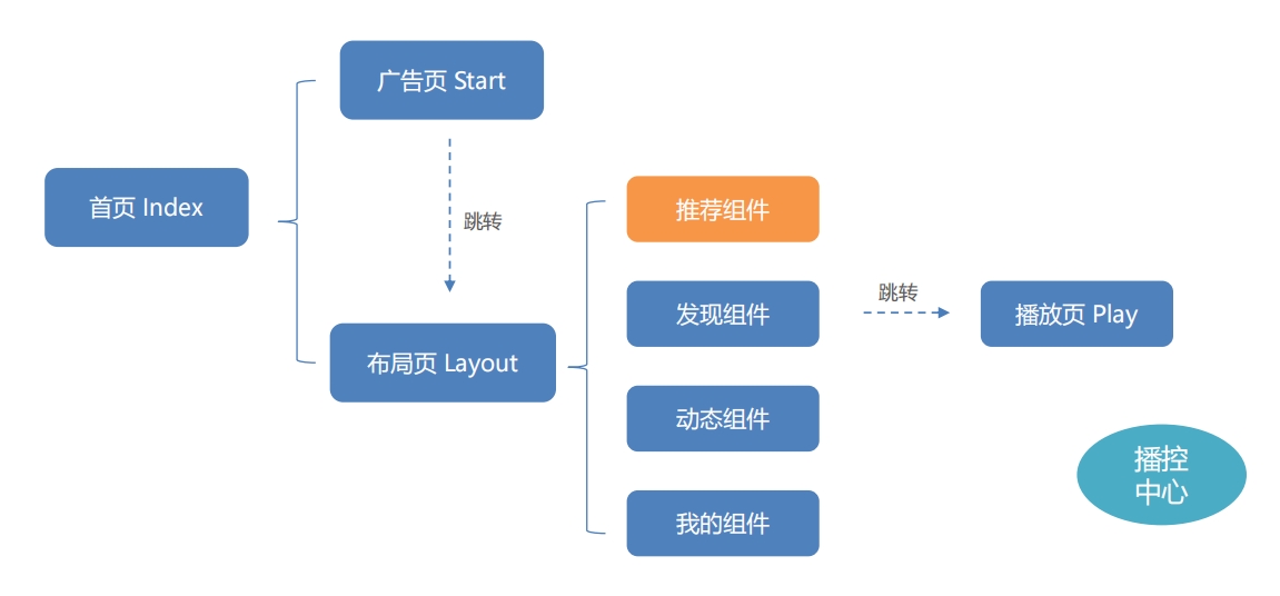
- 先整体再局部:整体从上到下布局,使用
Column()组件:
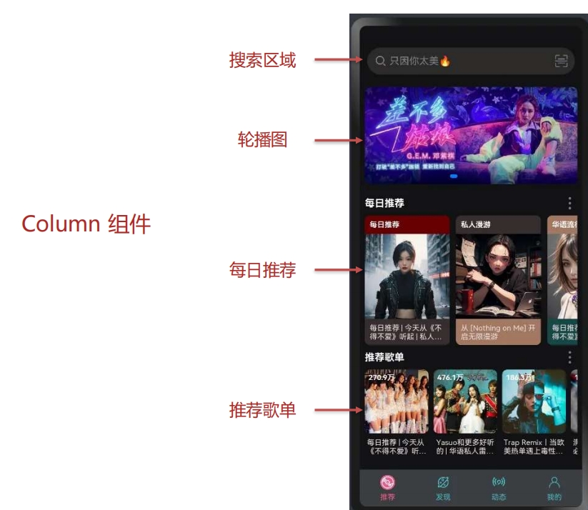
7.4.1 搜索区域
- 搜索区域(对于整体推荐页面来说--局部)是横向的布局,使用
Row()组件:
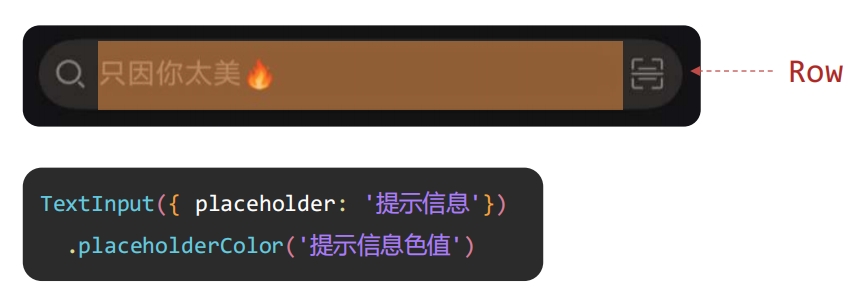
- 示例代码:
@Component
//export 导出,其它组件才能使用
export struct Recommend {
build() {
Column(){
//搜索区域
Row(){
//左边放大镜图
Image($r('app.media.ic_search'))
.width(22)
.fillColor('#817D83')
//搜索input
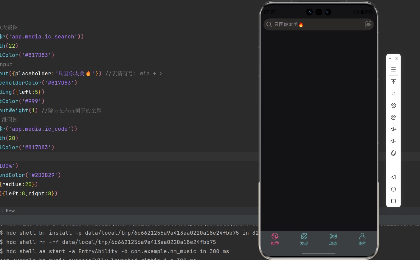
TextInput({placeholder:'只因你太美🔥'}) //表情符号: win + >
.placeholderColor('#817D83')
.padding({left:5})
.fontColor('#999')
.layoutWeight(1) //除去左右占剩下的全部
//右边二维码图
Image($r('app.media.ic_code'))
.width(20)
.fillColor('#817D83')
}
.width('100%')
.backgroundColor('#2D2B29')
.border({radius:20})
.padding({left:8,right:8})
}
.width('100%')
.height('100%')
.padding({left:10,right:10,top:5,bottom:5})
}
}📌 说明:
- 输入框组件
TextInput():
TextInput({placeholder:'提示信息'})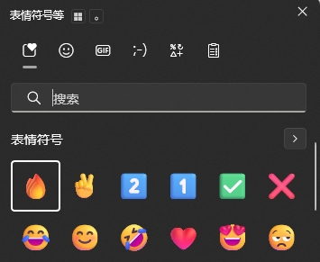
.placeholderColor('#xxxxxx') //提示信息色值- 想要使用点表情符号,可以
win + >快捷键调出windows自带的:
- 回顾:想要占剩余部分的全部:
.layoutWeight(1)- 效果:
7.4.2 轮播图区域
- 注意 : 网络图片需要开通 Internet 权限
- 示例代码:
@Component
//export 导出,其它组件才能使用
export struct Recommend {
  // 轮播图数据
  swiperList: string[] = [
    "http://yjy-teach-oss.oss-cn-beijing.aliyuncs.com/HeimaCloudMusic/banner1.png",
    "http://yjy-teach-oss.oss-cn-beijing.aliyuncs.com/HeimaCloudMusic/banner2.png",
    "http://yjy-teach-oss.oss-cn-beijing.aliyuncs.com/HeimaCloudMusic/banner3.png",
    "http://yjy-teach-oss.oss-cn-beijing.aliyuncs.com/HeimaCloudMusic/banner4.png",
    "http://yjy-teach-oss.oss-cn-beijing.aliyuncs.com/HeimaCloudMusic/banner5.png"
  ]

  build() {
    Column({space:10}){
      //搜索区域
      Row(){
        //左边放大镜图
        Image($r('app.media.ic_search'))
          .width(22)
          .fillColor('#817D83')
        //搜索input
        TextInput({placeholder:'只因你太美🔥'}) //表情符号: win + >
          .placeholderColor('#817D83')
          .padding({left:5})
          .fontColor('#999')
          .layoutWeight(1) //除去左右占剩下的全部
        //右边二维码图
        Image($r('app.media.ic_code'))
          .width(20)
          .fillColor('#817D83')
      }
      .width('100%')
      .backgroundColor('#2D2B29')
      .border({radius:20})
      .padding({left:8,right:8})
      //轮播图区域
      Swiper(){
        ForEach(this.swiperList,(item:string)=>{
          Image(item)
            .width('100%')
            .height(170) //加个固定的高会好点,因为图片高度不同,切换的时候会有异常
            .border({radius:10})
        })
      }
        .autoPlay(true)

    }
    .width('100%')
    .height('100%')
    .padding({left:10,right:10,top:5,bottom:5})
  }
}📌 说明:
- 开通网络权限:
"module": {
    "requestPermissions":[
      {
        "name": 'ohos.permission.INTERNET'
      }
    ]
}- 轮播图组件
Swiper()
Swiper(){
    //内容
}
.autoPlay(true) //自动播放- 效果:
7.4.3 每日推荐区域
- 任务:
前言:
这个
titleBuiler自定义组件在5.1写过了,直接复用就好了,高度改成40,否则下面可能不够对于
List组件,之前我们学的歌曲列表案例是纵向排列的,这里是横向排列的,那么我们需要下面这个语句:
.listDirection(Axis.Horizontal) //调整List组件的布局方向为水平- 示例代码:
interface recommendDailyType {
  img: string  // 图片
  title: string  // 简介文字
  type:string  // 标题文字
  top:string  // 标题背景色
  bottom: string  // 简介背景色
}

@Component
//export 导出,其它组件才能使用
export struct Recommend {
  // 轮播图数据
  swiperList: string[] = [
    "http://yjy-teach-oss.oss-cn-beijing.aliyuncs.com/HeimaCloudMusic/banner1.png",
    "http://yjy-teach-oss.oss-cn-beijing.aliyuncs.com/HeimaCloudMusic/banner2.png",
    "http://yjy-teach-oss.oss-cn-beijing.aliyuncs.com/HeimaCloudMusic/banner3.png",
    "http://yjy-teach-oss.oss-cn-beijing.aliyuncs.com/HeimaCloudMusic/banner4.png",
    "http://yjy-teach-oss.oss-cn-beijing.aliyuncs.com/HeimaCloudMusic/banner5.png"
  ]

  // 每日推荐数据
  dailyRecommend: recommendDailyType[] = [
    {
      img: 'http://yjy-teach-oss.oss-cn-beijing.aliyuncs.com/HeimaCloudMusic/recommend1.png',
      title: '每日推荐 | 今天从《不得不爱》听起 | 私人雷达',
      type: '每日推荐',
      top: '#660000',
      bottom: '#382e2f'
    },
    {
      img: 'http://yjy-teach-oss.oss-cn-beijing.aliyuncs.com/HeimaCloudMusic/recommend2.png',
      title: '从 [Nothing on Me] 开启无限漫游',
      type: '私人漫游',
      top: '#382e2f',
      bottom: '#a37862'
    },
    {
      img: 'http://yjy-teach-oss.oss-cn-beijing.aliyuncs.com/HeimaCloudMusic/recommend3.png',
      title: '每日推荐 | 今天从《不得不爱》听起 | 私人雷达',
      type: '华语流行',
      top: '#a37862',
      bottom: '#174847'
    },
    {
      img: 'http://yjy-teach-oss.oss-cn-beijing.aliyuncs.com/HeimaCloudMusic/recommend4.png',
      title: '每日推荐 | 今天从《不得不爱》听起 | 私人雷达',
      type: '私人雷达',
      top: '#174847',
      bottom: '#174847'
    }
  ]

  //自定义标题栏
  @Builder
  titleBuilder(title:string){
    Row() {
      Text(title)
        .fontColor('#fff')
        .fontWeight(700)
        .layoutWeight(1)
      Image($r('app.media.ic_more'))
        .width(22)
        .fillColor('#fff')
    }
    .width('100%')
    .height(40) //高度改成 `40` ,否则下面可能不够
  }

  build() {
    Column({space:10}){
      //搜索区域
      Row(){
        //左边放大镜图
        Image($r('app.media.ic_search'))
          .width(22)
          .fillColor('#817D83')
        //搜索input
        TextInput({placeholder:'只因你太美🔥'}) //表情符号: win + >
          .placeholderColor('#817D83')
          .padding({left:5})
          .fontColor('#999')
          .layoutWeight(1) //除去左右占剩下的全部
        //右边二维码图
        Image($r('app.media.ic_code'))
          .width(20)
          .fillColor('#817D83')
      }
      .width('100%')
      .backgroundColor('#2D2B29')
      .border({radius:20})
      .padding({left:8,right:8})
      //轮播图区域
      Swiper(){
        ForEach(this.swiperList,(item:string)=>{
          Image(item)
            .width('100%')
            .height(170) //加个固定的高会好点,因为图片高度不同,切换的时候会有异常
            .border({radius:10})
        })
      }
        .autoPlay(true)
      //每日推荐区域
      this.titleBuilder('每日推荐') //自定义构建函数 -> @Builder
      List(){
        ForEach(this.dailyRecommend,(item:recommendDailyType) => {
          ListItem(){
            //局部每一个垂直布局
            Column(){
              //上方文字
              Text(item.type)
                .width('100%')
                .height(40)
                .backgroundColor(item.top)
                .fontSize(14)
                .padding({left:5})
                .fontColor('#fff')
              //中间图片
              Image(item.img)
                .width('100%')
              //下方文字
              Text(item.title)
                .width('100%')
                .backgroundColor(item.bottom)
                .padding(5)
                .fontSize(14)
                .fontColor('#fff')
                .maxLines(2)  //文本显示最大行数
                .textOverflow({overflow:TextOverflow.Ellipsis}) //  文本溢出的显示方式 -> 省略号
            }
              .width('40%')
              // .height(200)
              // .backgroundColor(Color.Pink)
              .border({radius:10})
              .margin({right:10})
              .clip(true) //根据外层的Column有radius来裁剪里面的内容
          }
        })
      }
        .listDirection(Axis.Horizontal)  //调整List组件的布局方向


    }
    .width('100%')
    .height('100%')
    .padding({left:10,right:10,top:5,bottom:5})
  }
}📌 说明:
- 1). 裁剪属性是什么 ❓
.clip(true) //根据外层的Column有radius来裁剪里面的内容- 2). 如何实现文本溢出显示省略号 ❓
Text()
    .maxLines(行数)  //文本显示最大行数
.textOverflow({overflow:TextOverflow.Ellipsis}) // 文本溢出的显示方式- 效果:
7.4.4 推荐歌单区域
- 任务:
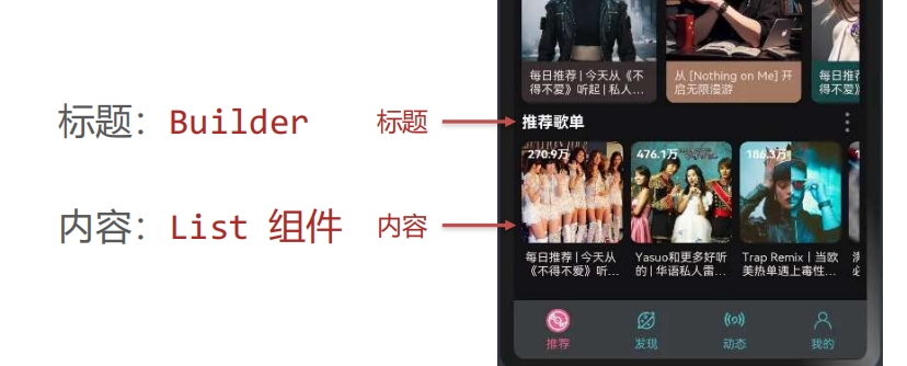
其实就跟上面的
每日推荐区域几乎一样了...
- 前言:
❗ 在我们写了
推荐歌单的那个titleBuilder之后,会发现页面没有显示是因为我们前面的
每日推荐的那个List组件有个默认高度太高了,即使我们把它的方向改成水平了,但是它还是有个默认高度会挤走下面的内容
解决方案:给上面的
List()加一个高度
- 示例代码:
//每日推荐
interface recommendDailyType {
  img: string  // 图片
  title: string  // 简介文字
  type:string  // 标题文字
  top:string  // 标题背景色
  bottom: string  // 简介背景色
}

//推荐歌单
interface recommendListType {
  img: string
  title: string
  count:string
}

@Component
//export 导出,其它组件才能使用
export struct Recommend {
  // 轮播图数据
  swiperList: string[] = [
    "http://yjy-teach-oss.oss-cn-beijing.aliyuncs.com/HeimaCloudMusic/banner1.png",
    "http://yjy-teach-oss.oss-cn-beijing.aliyuncs.com/HeimaCloudMusic/banner2.png",
    "http://yjy-teach-oss.oss-cn-beijing.aliyuncs.com/HeimaCloudMusic/banner3.png",
    "http://yjy-teach-oss.oss-cn-beijing.aliyuncs.com/HeimaCloudMusic/banner4.png",
    "http://yjy-teach-oss.oss-cn-beijing.aliyuncs.com/HeimaCloudMusic/banner5.png"
  ]

  // 每日推荐数据
  dailyRecommend: recommendDailyType[] = [
    {
      img: 'http://yjy-teach-oss.oss-cn-beijing.aliyuncs.com/HeimaCloudMusic/recommend1.png',
      title: '每日推荐 | 今天从《不得不爱》听起 | 私人雷达',
      type: '每日推荐',
      top: '#660000',
      bottom: '#382e2f'
    },
    {
      img: 'http://yjy-teach-oss.oss-cn-beijing.aliyuncs.com/HeimaCloudMusic/recommend2.png',
      title: '从 [Nothing on Me] 开启无限漫游',
      type: '私人漫游',
      top: '#382e2f',
      bottom: '#a37862'
    },
    {
      img: 'http://yjy-teach-oss.oss-cn-beijing.aliyuncs.com/HeimaCloudMusic/recommend3.png',
      title: '每日推荐 | 今天从《不得不爱》听起 | 私人雷达',
      type: '华语流行',
      top: '#a37862',
      bottom: '#174847'
    },
    {
      img: 'http://yjy-teach-oss.oss-cn-beijing.aliyuncs.com/HeimaCloudMusic/recommend4.png',
      title: '每日推荐 | 今天从《不得不爱》听起 | 私人雷达',
      type: '私人雷达',
      top: '#174847',
      bottom: '#174847'
    }
  ]

  // 推荐歌单数据
  recommendList: recommendListType[] = [
    {
      img: 'http://yjy-teach-oss.oss-cn-beijing.aliyuncs.com/HeimaCloudMusic/list1.jpg',
      title: '每日推荐 | 今天从《不得不爱》听起 | 私人雷达',
      count: '270.9万'
    },
    {
      img: 'http://yjy-teach-oss.oss-cn-beijing.aliyuncs.com/HeimaCloudMusic/list2.jpg',
      title: 'Yasuo和更多好听的 | 华语私人雷达 | 回忆8090',
      count: '476.1万'
    },
    {
      img: 'http://yjy-teach-oss.oss-cn-beijing.aliyuncs.com/HeimaCloudMusic/list3.jpg',
      title: 'Trap Remix丨当欧美热单遇上毒性低音',
      count: '186.3万'
    },
    {
      img: 'http://yjy-teach-oss.oss-cn-beijing.aliyuncs.com/HeimaCloudMusic/list4.jpg',
      title: '满级人类进化之路必备BGM | 根本停不下来',
      count: '186.3万'
    },
    {
      img: 'http://yjy-teach-oss.oss-cn-beijing.aliyuncs.com/HeimaCloudMusic/list5.jpg',
      title: '认真去聆听这个世界的每一分每一秒 (强烈推荐)',
      count: '362.8万'
    }
  ]

  //自定义标题栏
  @Builder
  titleBuilder(title:string){
    Row() {
      Text(title)
        .fontColor('#fff')
        .fontWeight(700)
        .layoutWeight(1)
      Image($r('app.media.ic_more'))
        .width(22)
        .fillColor('#fff')
    }
    .width('100%')
    .height(40)
  }

  build() {
    Column({space:10}){
      //搜索区域
      Row(){
        //左边放大镜图
        Image($r('app.media.ic_search'))
          .width(22)
          .fillColor('#817D83')
        //搜索input
        TextInput({placeholder:'只因你太美🔥'}) //表情符号: win + >
          .placeholderColor('#817D83')
          .padding({left:5})
          .fontColor('#999')
          .layoutWeight(1) //除去左右占剩下的全部
        //右边二维码图
        Image($r('app.media.ic_code'))
          .width(20)
          .fillColor('#817D83')
      }
      .width('100%')
      .backgroundColor('#2D2B29')
      .border({radius:20})
      .padding({left:8,right:8})

      //轮播图区域
      Swiper(){
        ForEach(this.swiperList,(item:string)=>{
          Image(item)
            .width('100%')
            .height(170) //加个固定的高会好点,因为图片高度不同,切换的时候会有异常
            .border({radius:10})
        })
      }
        .autoPlay(true)

      //每日推荐区域
      this.titleBuilder('每日推荐') //自定义构建函数 -> @Builder
      List(){
        ForEach(this.dailyRecommend,(item:recommendDailyType) => {
          ListItem(){
            //局部每一个垂直布局
            Column(){
              //上方文字
              Text(item.type)
                .width('100%')
                .height(40)
                .backgroundColor(item.top)
                .fontSize(14)
                .padding({left:5})
                .fontColor('#fff')
              //中间图片
              Image(item.img)
                .width('100%')
              //下方文字
              Text(item.title)
                .width('100%')
                .backgroundColor(item.bottom)
                .padding(5)
                .fontSize(14)
                .fontColor('#fff')
                .maxLines(2)  //文本显示最大行数
                .textOverflow({overflow:TextOverflow.Ellipsis}) //  文本溢出的显示方式 -> 省略号
            }
              .width('40%')
              // .height(200)
              // .backgroundColor(Color.Pink)
              .border({radius:10})
              .margin({right:10})
              .clip(true) //根据外层的Column有radius来裁剪里面的内容
          }
        })
      }
        .listDirection(Axis.Horizontal)  //调整List组件的布局方向
        .height(230)
        .scrollBar(BarState.Off)

      //推荐歌单
      this.titleBuilder('推荐歌单')
      List(){
        ForEach(this.recommendList,(item:recommendListType)=>{
          ListItem(){
            //局部每一个都是垂直的布局
            Column(){
              //里面左上角的文本和图片是层叠布局 --> Stack
              Stack({alignContent:Alignment.TopStart}){
                //图片
                Image(item.img)
                  .width('100%')
                  .height(100)
                  .border({radius:8})
                //左上角文字
                Text(item.count)
                  .fontColor('#fff')
                  .fontSize(12)
                  .fontWeight(700)
                  .margin(5)
              }
              //下方文字
              Text(item.title)
                .fontColor('#fff')
                .fontSize(14)
                .width('100%')
                .padding(5)
                .maxLines(2)
                .textOverflow({overflow:TextOverflow.Ellipsis})
            }
              .width('30%')
              // .height(200)
              // .backgroundColor(Color.Pink)
              .margin({right:10})
          }
        })
      }
        .listDirection(Axis.Horizontal) //把List组件的布局方向改成水平
    }

    .width('100%')
    .height('100%')
    .padding({left:10,right:10,top:5,bottom:5})
  }
}